IWR North America
Editorial studio.
White backdrop.
Lifestyle posing.
MHS Legacy
Natural light.
Heritage architecture.
Quiet luxury.
How marketing director Jessie Haupt built two deliberately different visual identities for two related companies, IWR North America (the operating business) and MHS Legacy (its parent). Same strategist, same photographer, two coexisting brands.
IWR North America · Editorial studio program
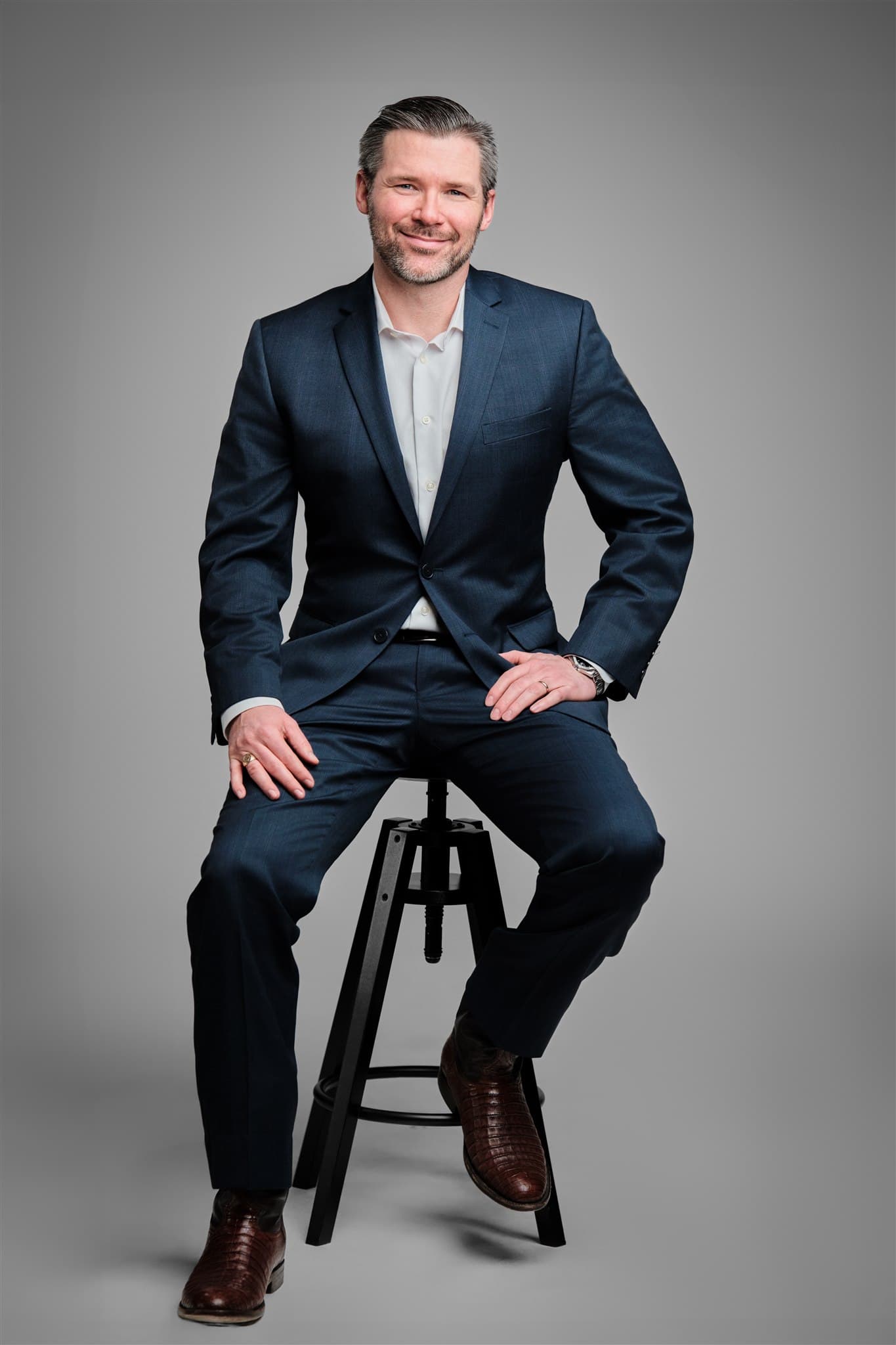

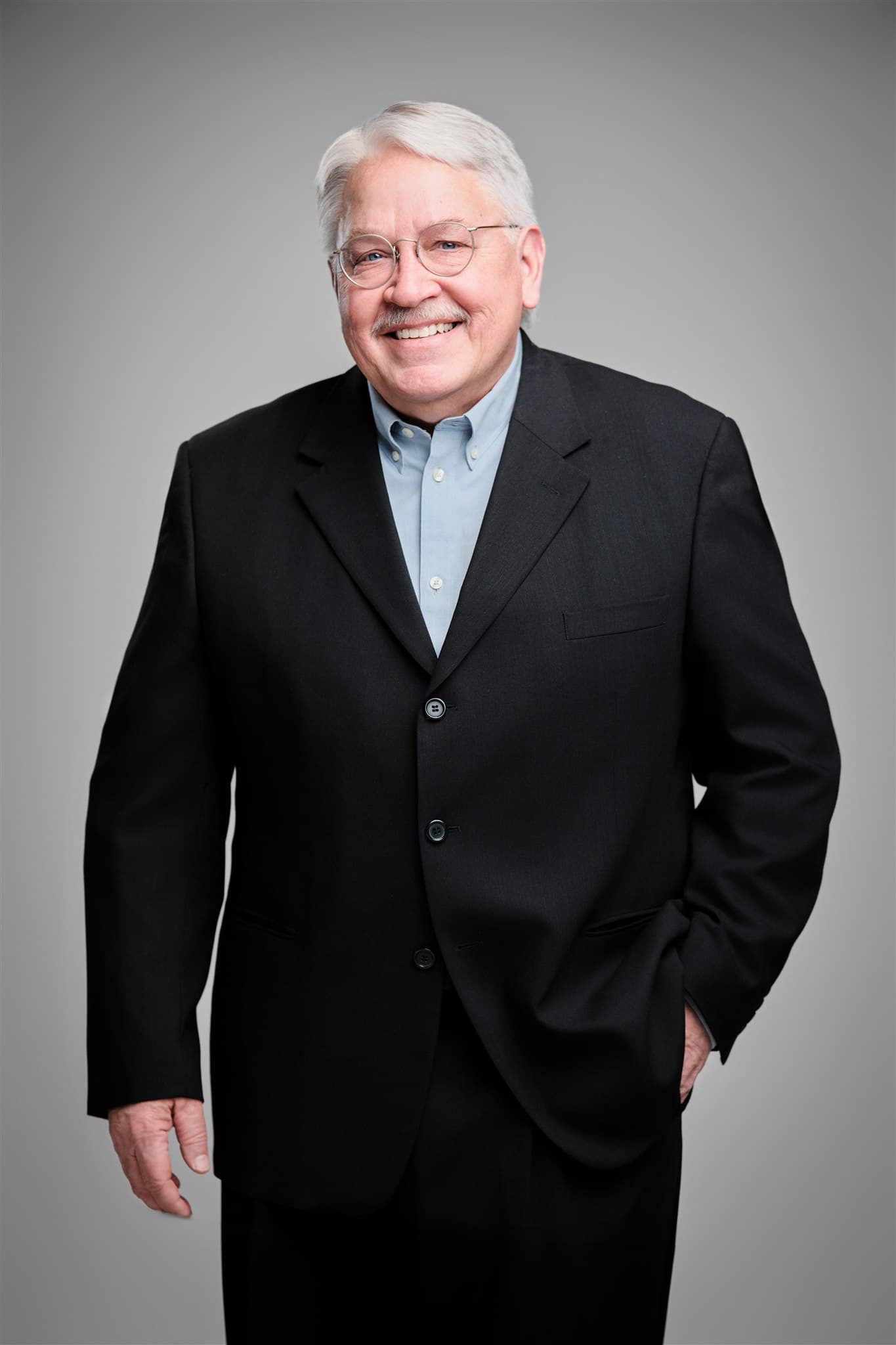
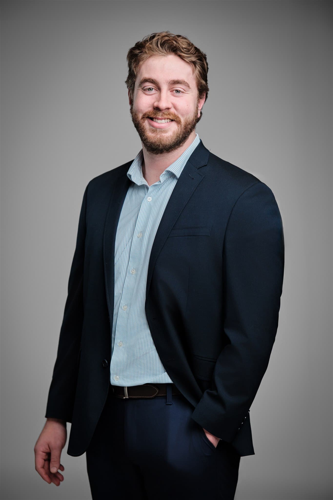
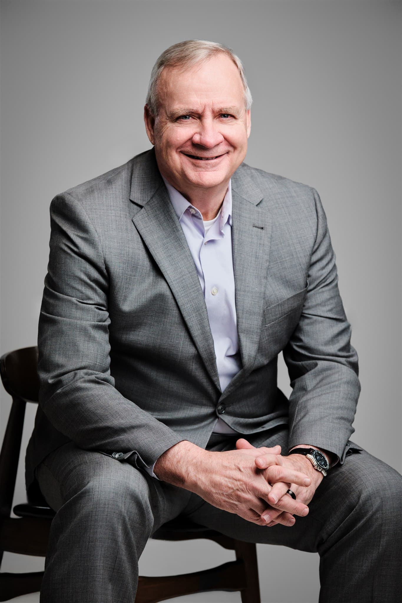
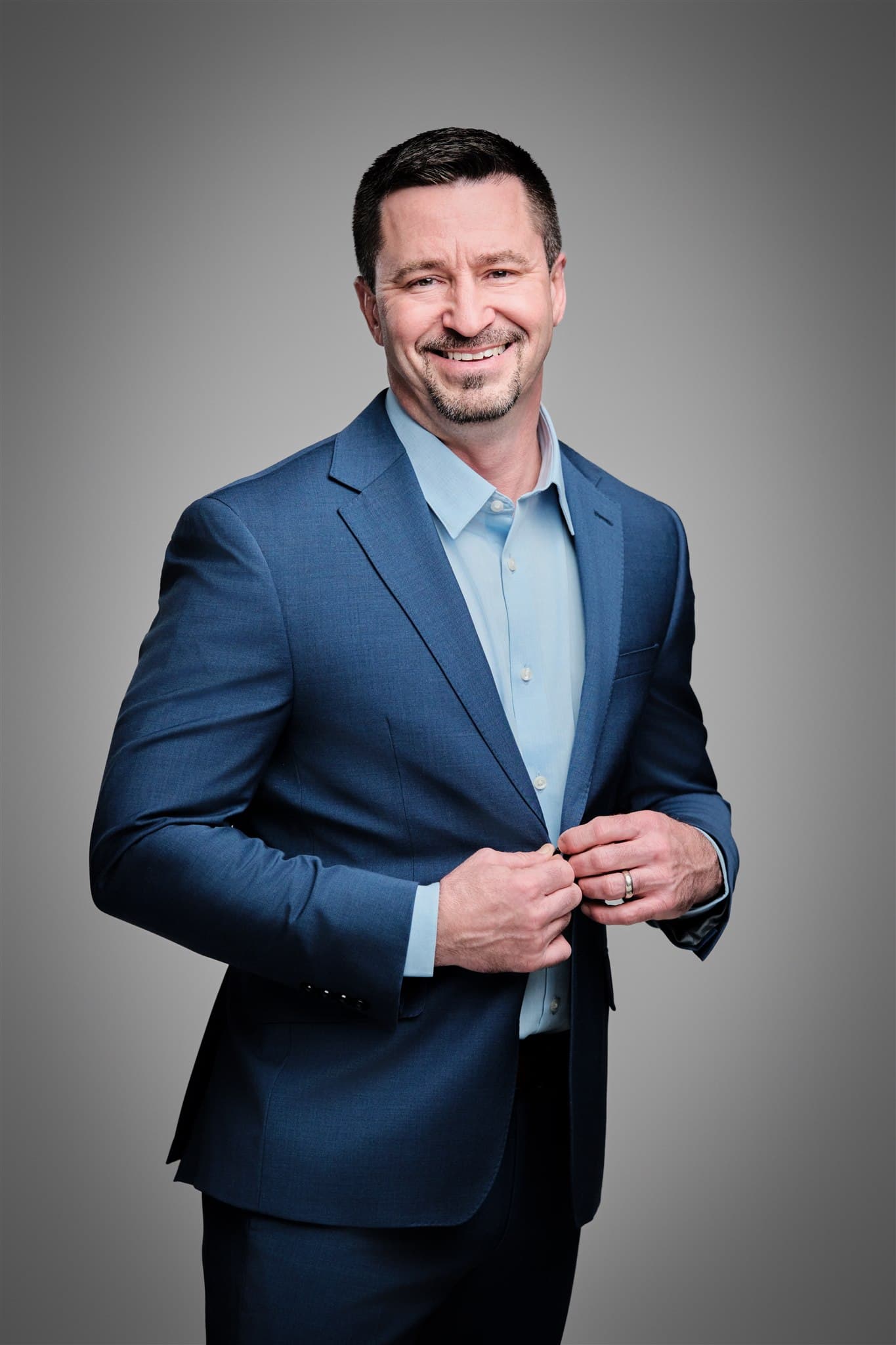
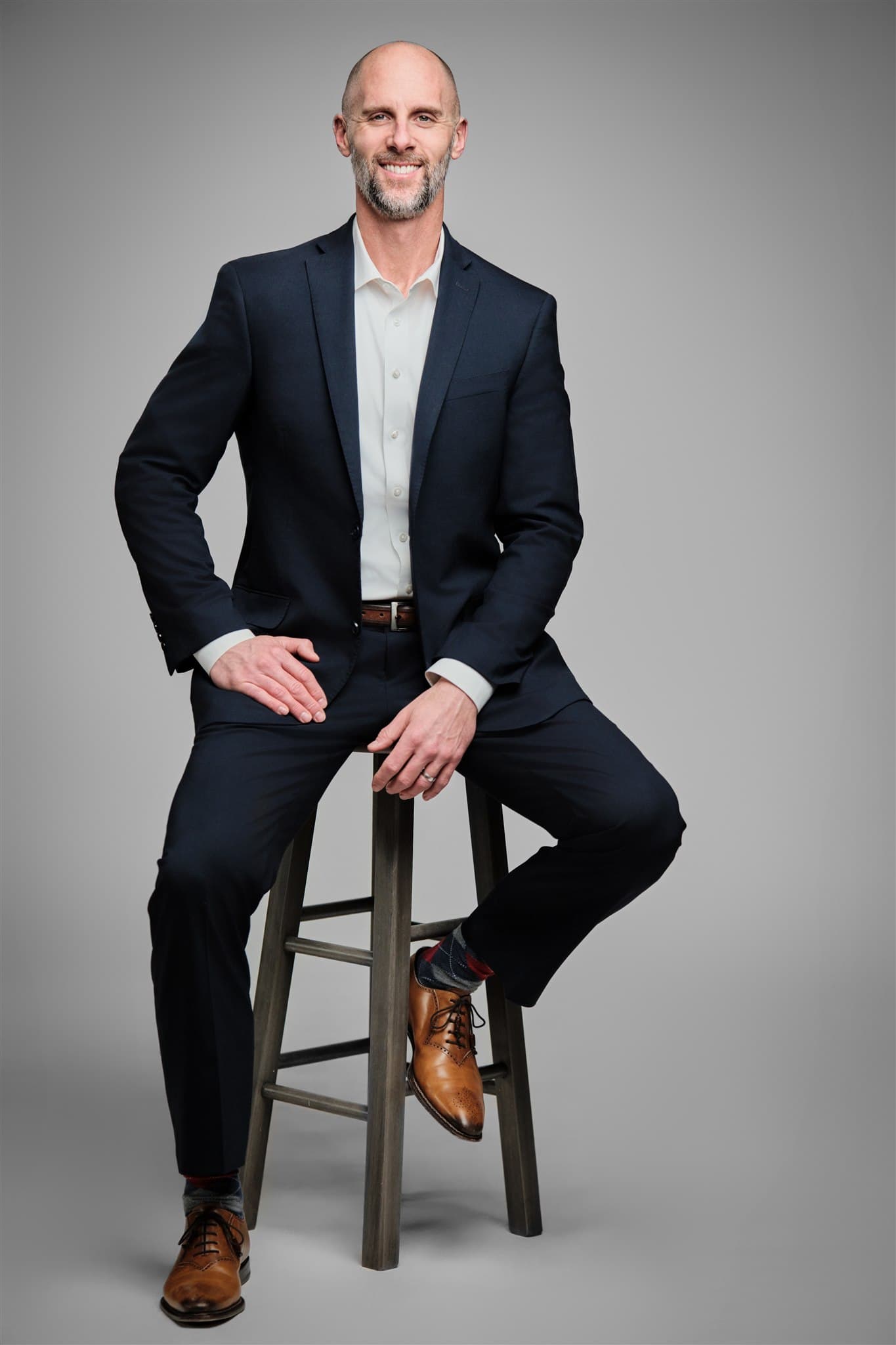
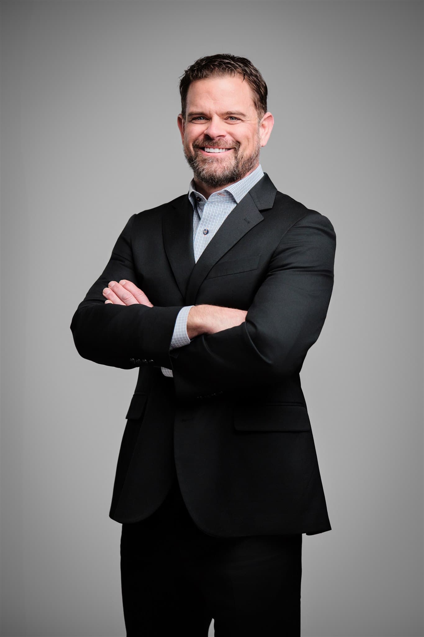
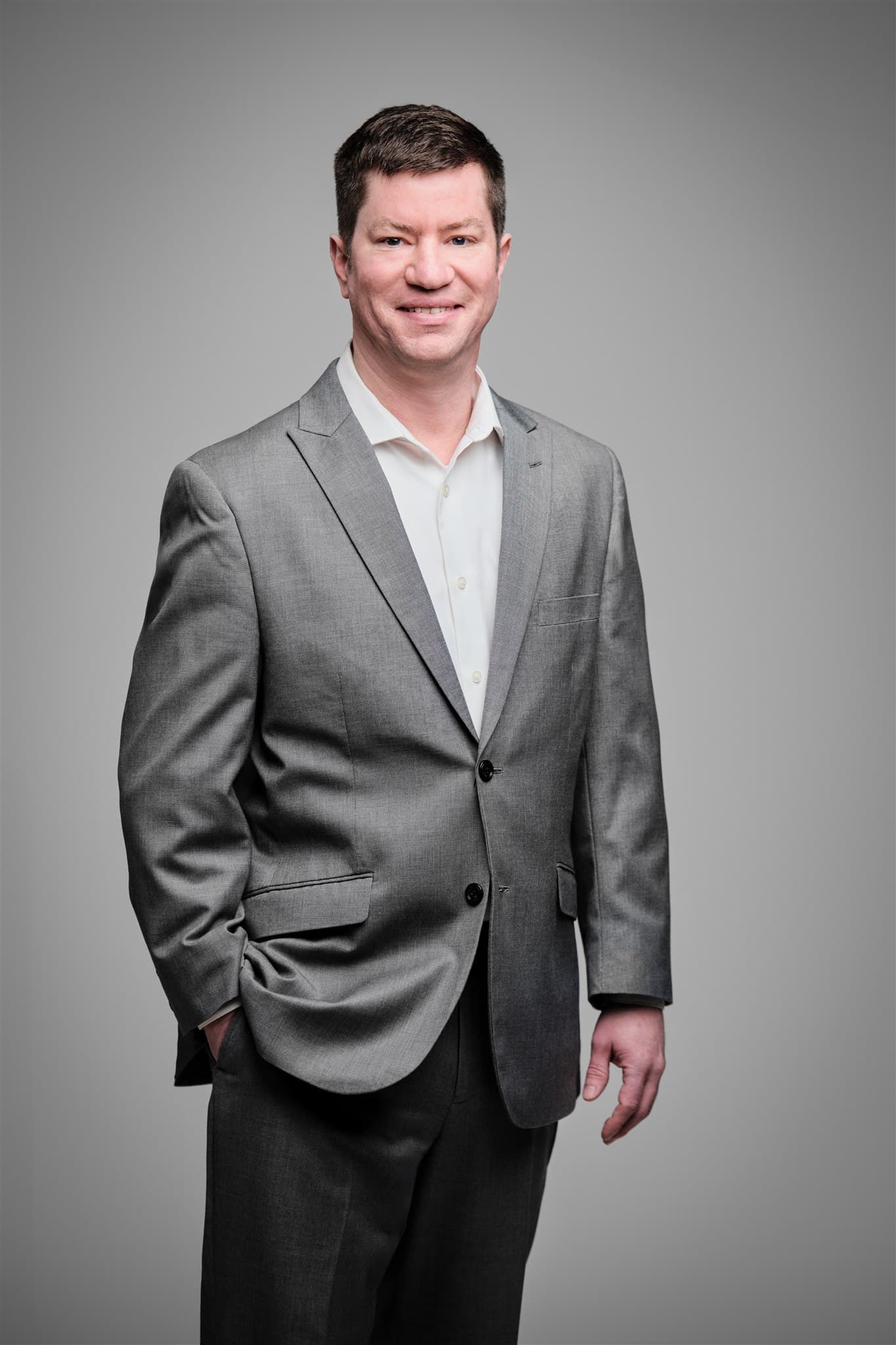
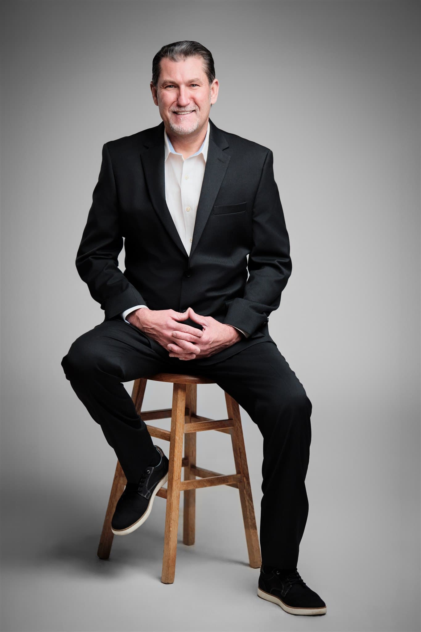
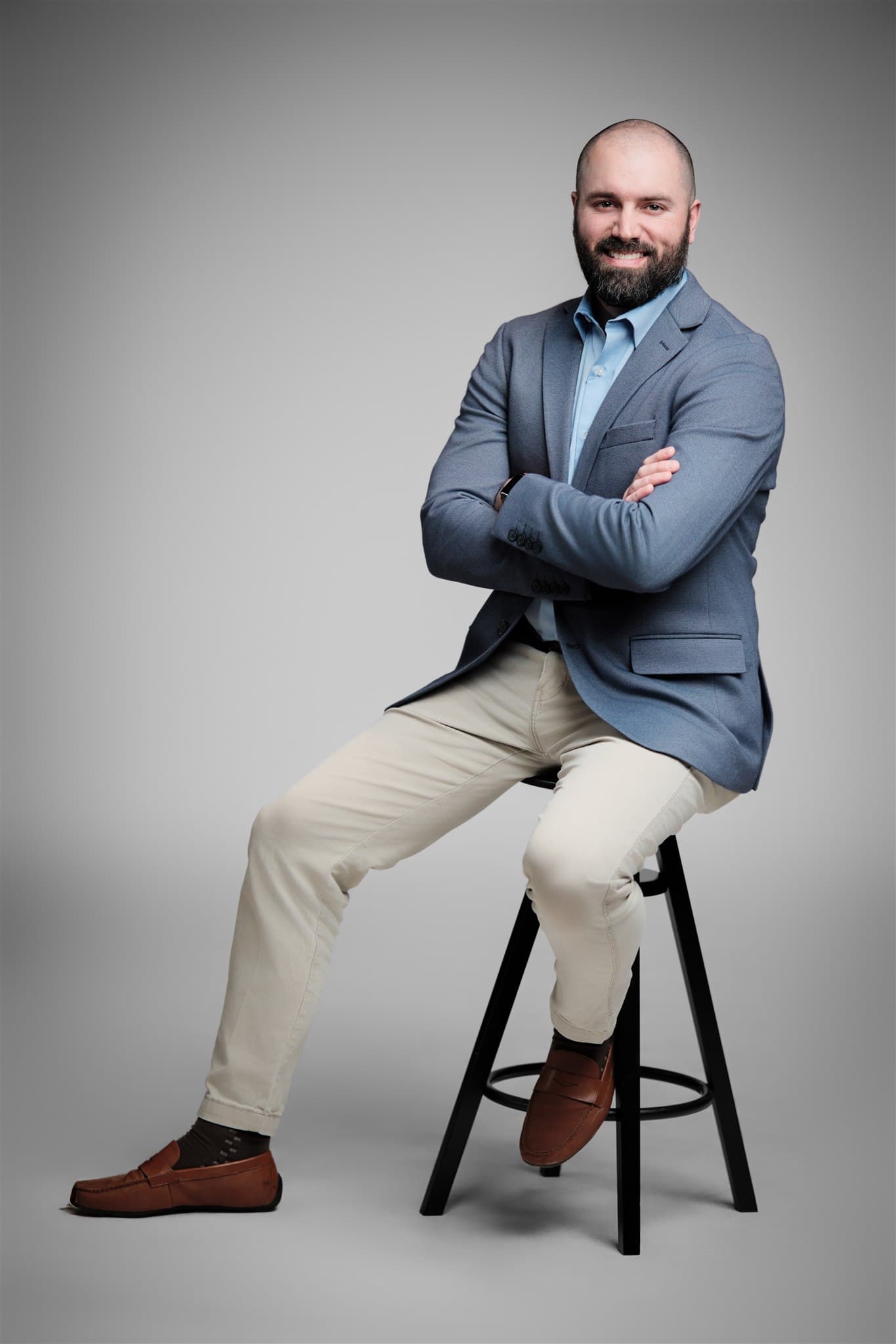
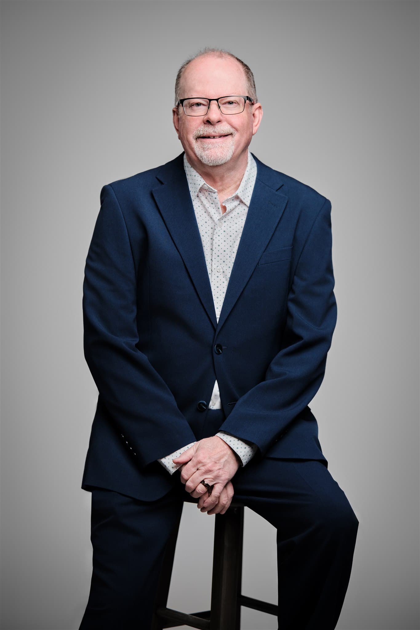
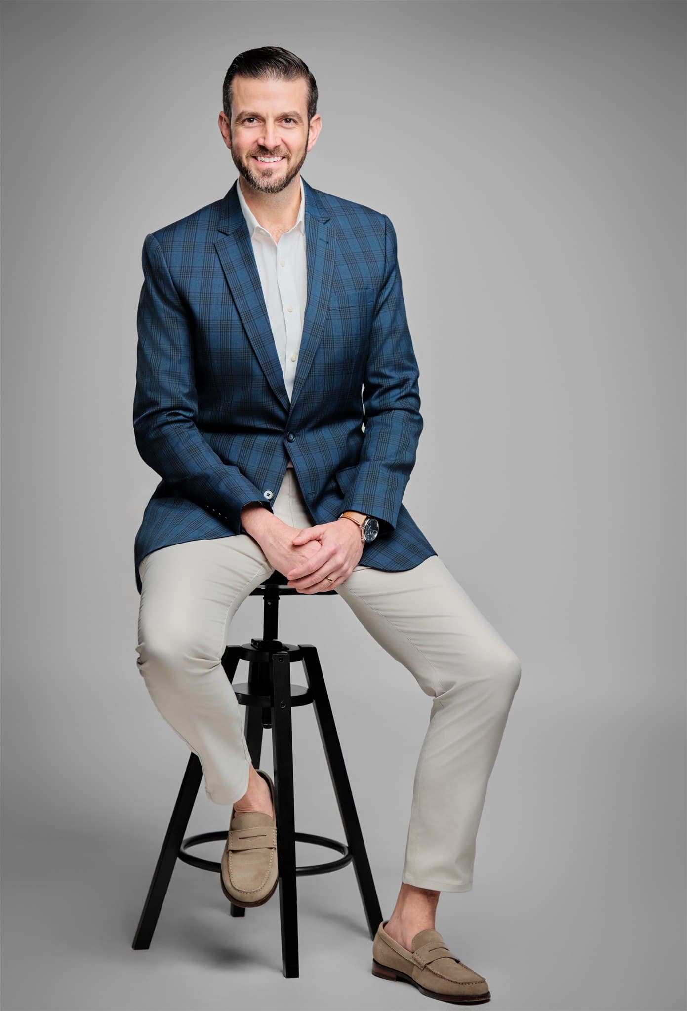
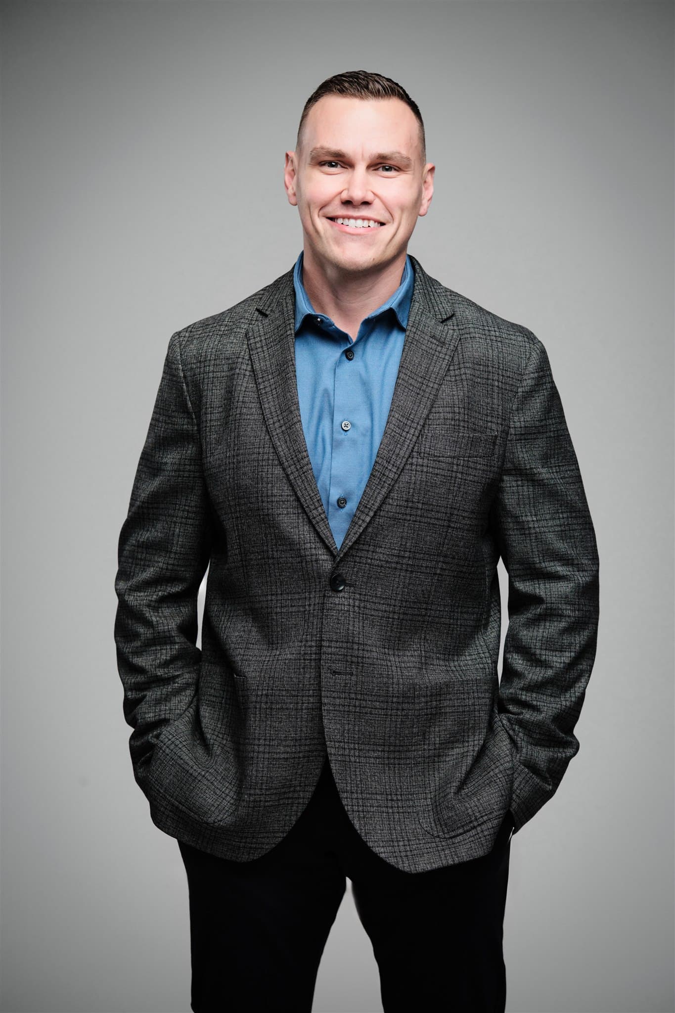
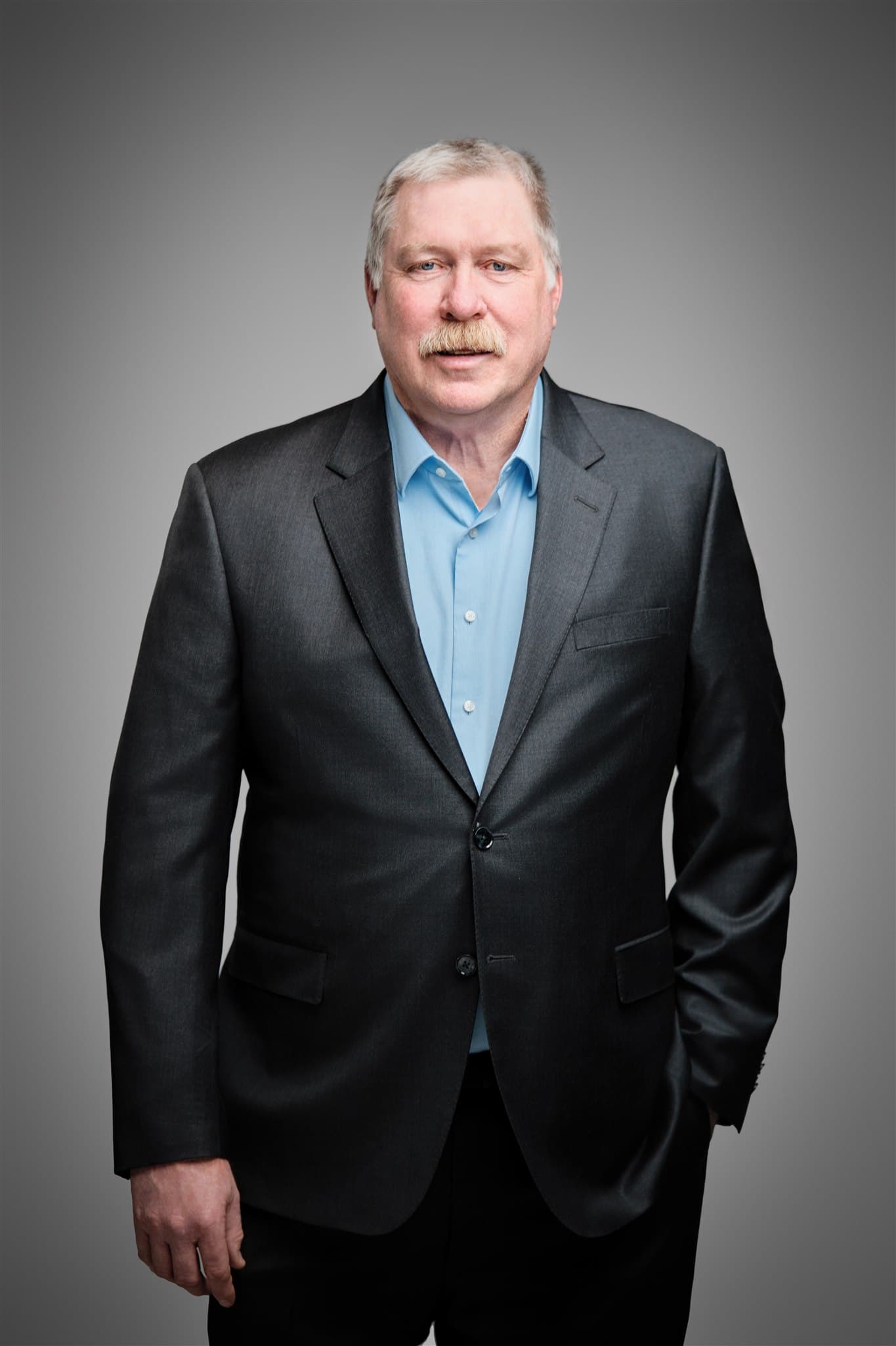
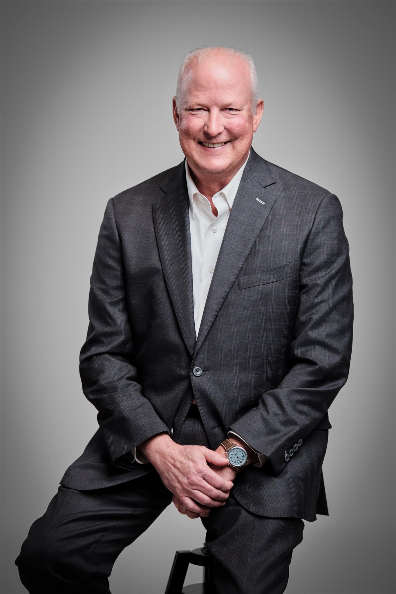
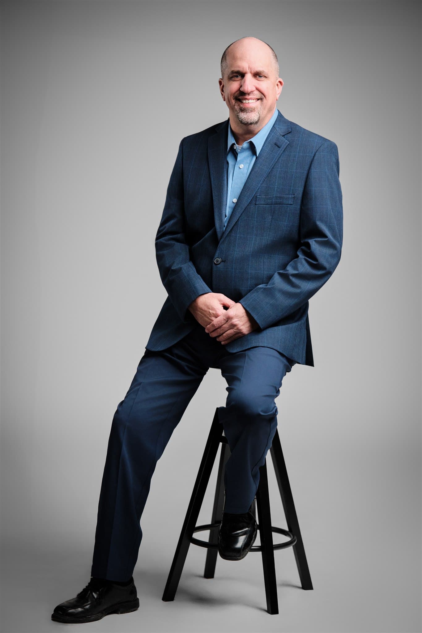
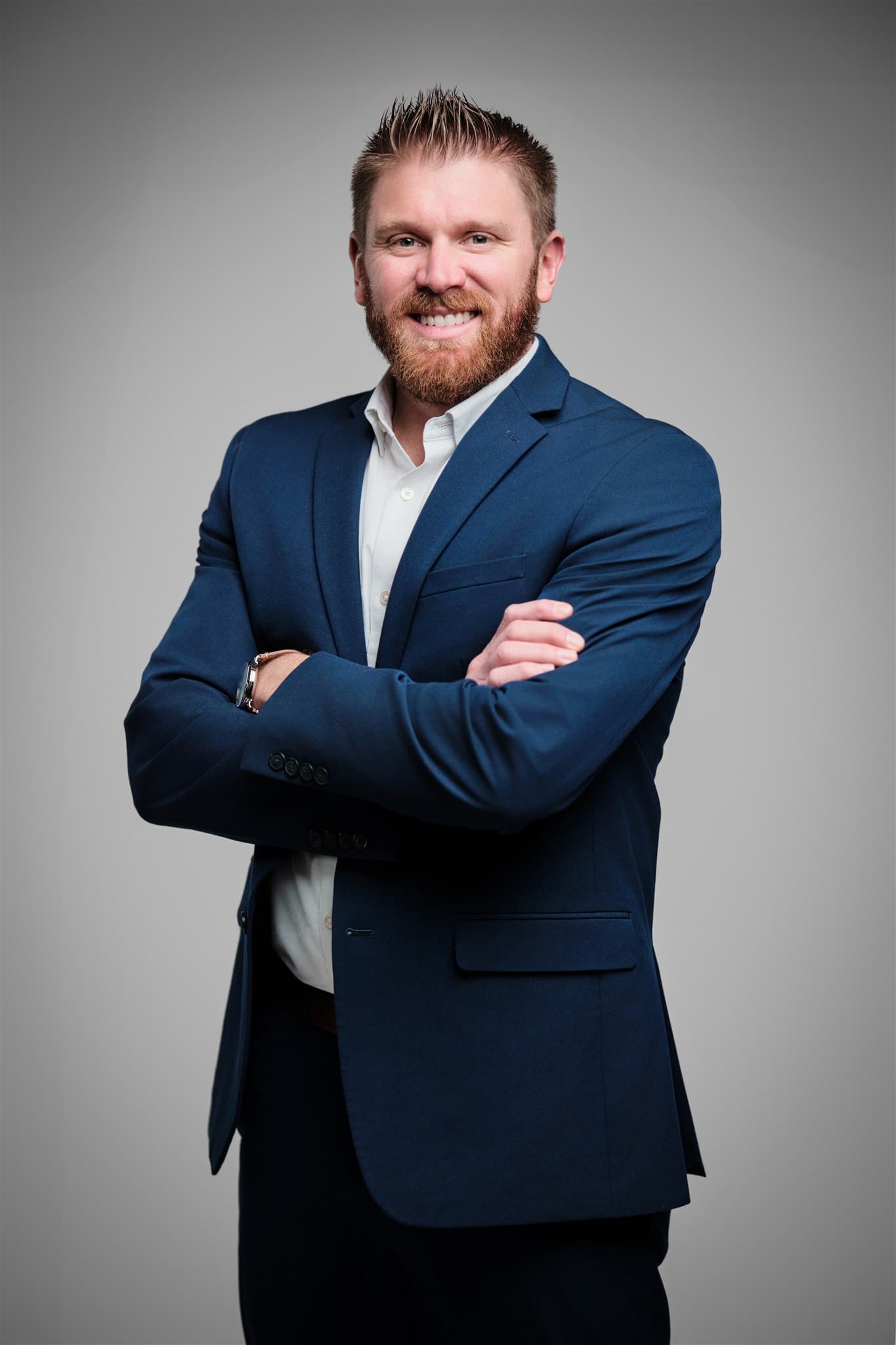
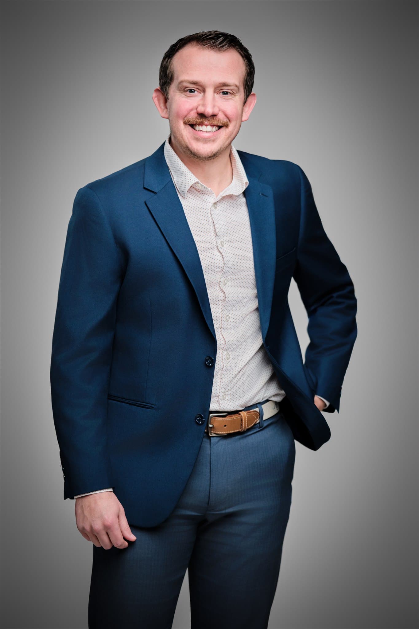
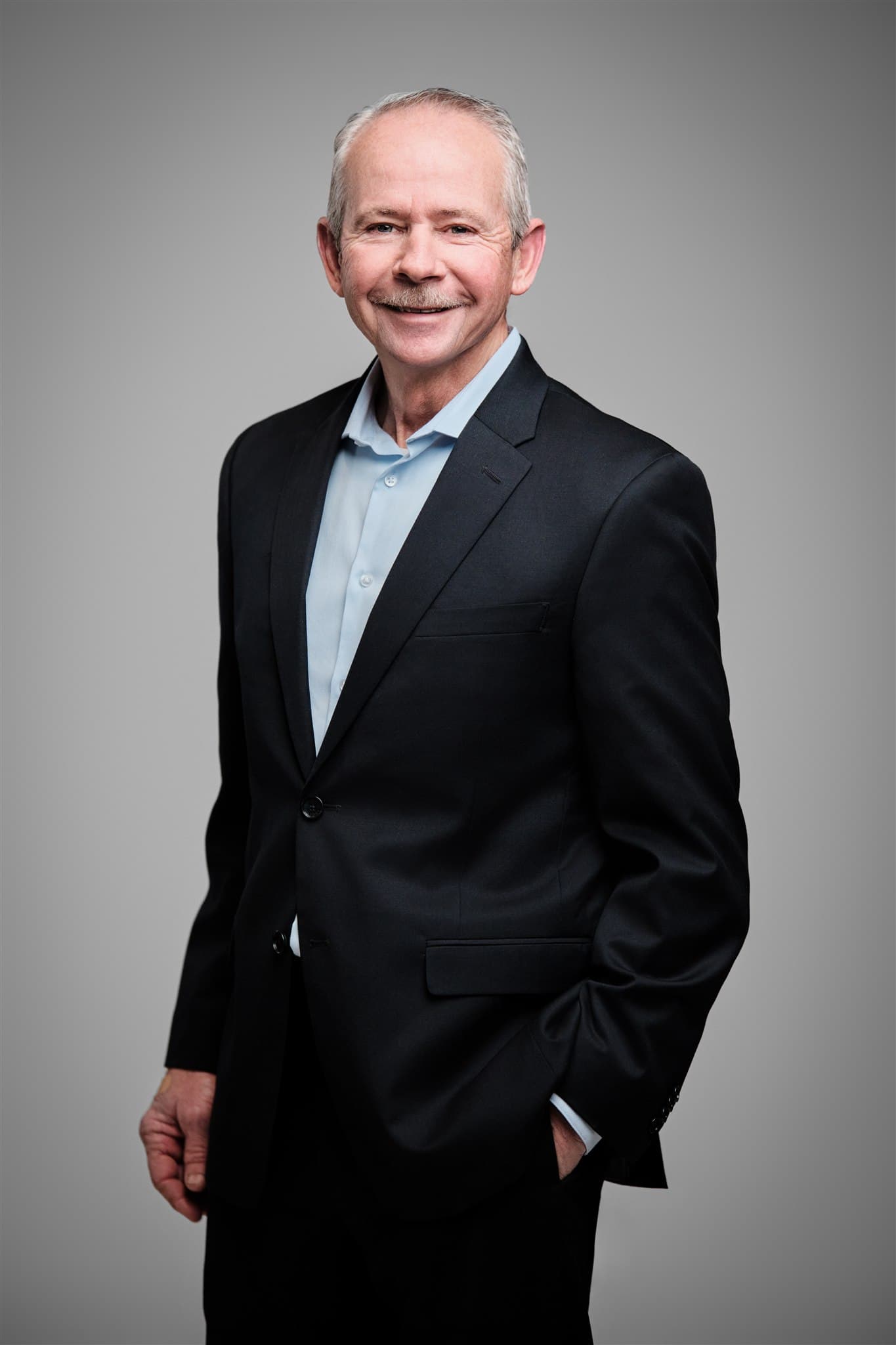
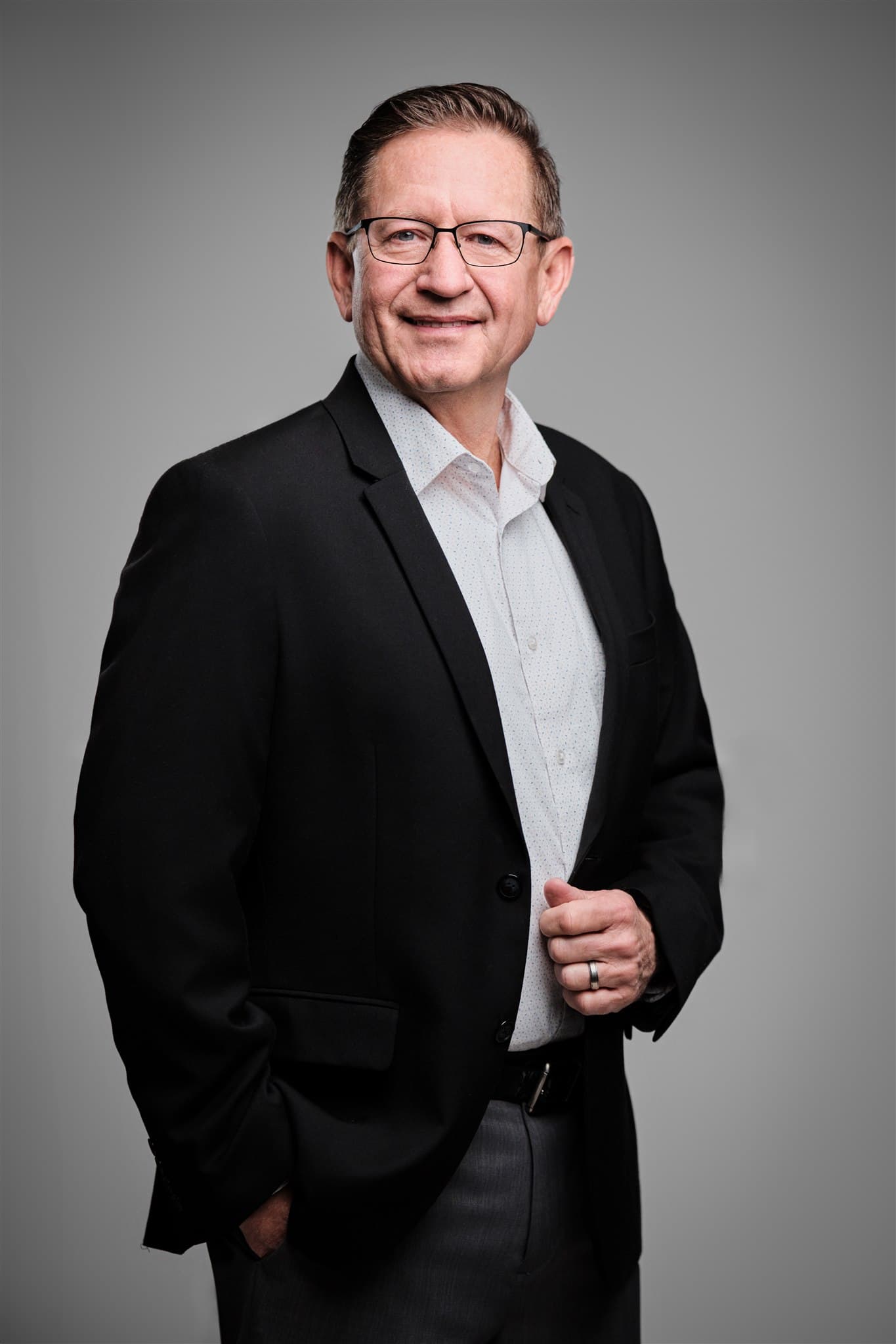
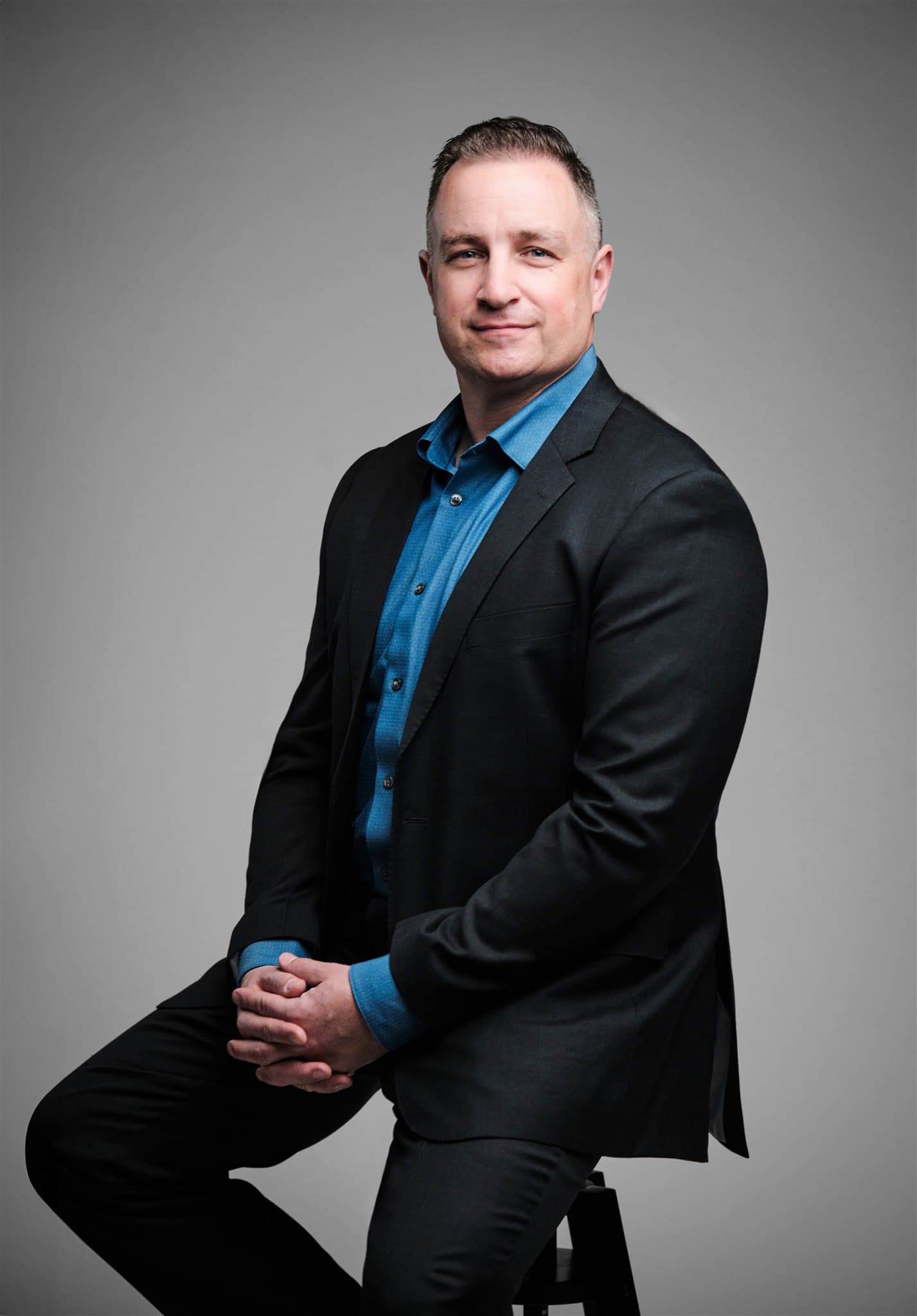
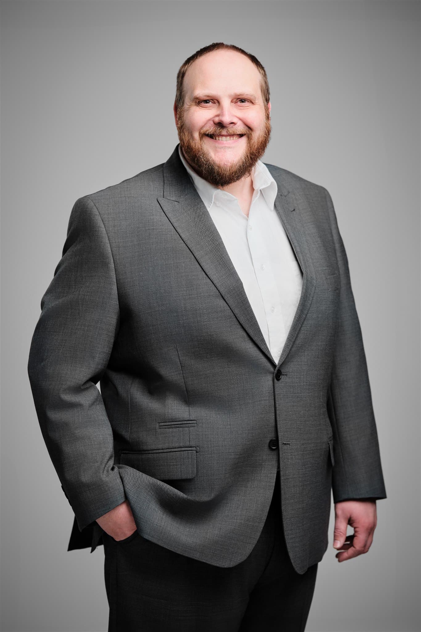
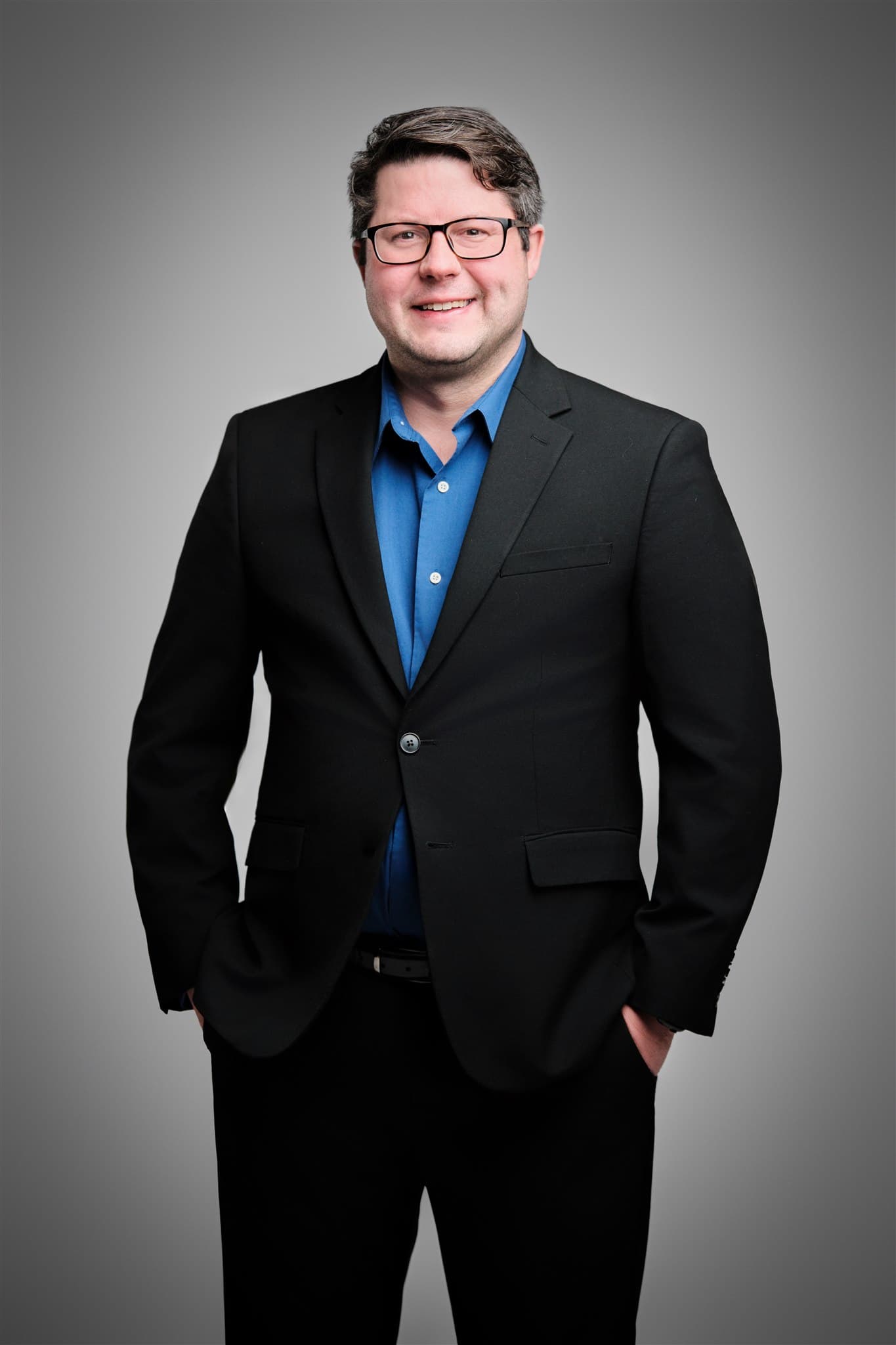
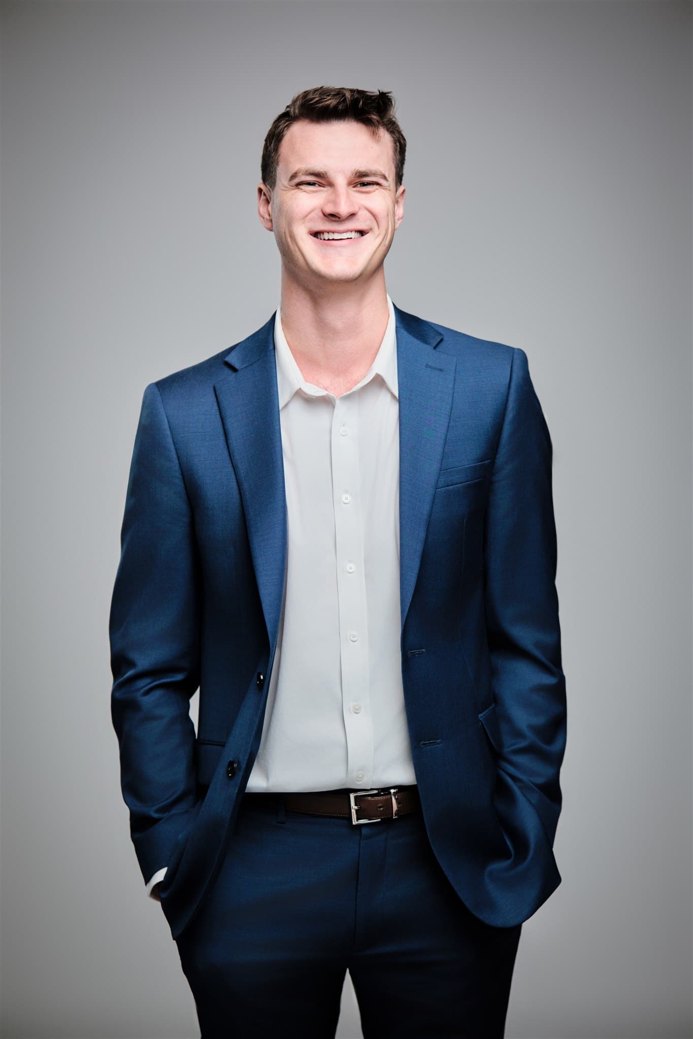
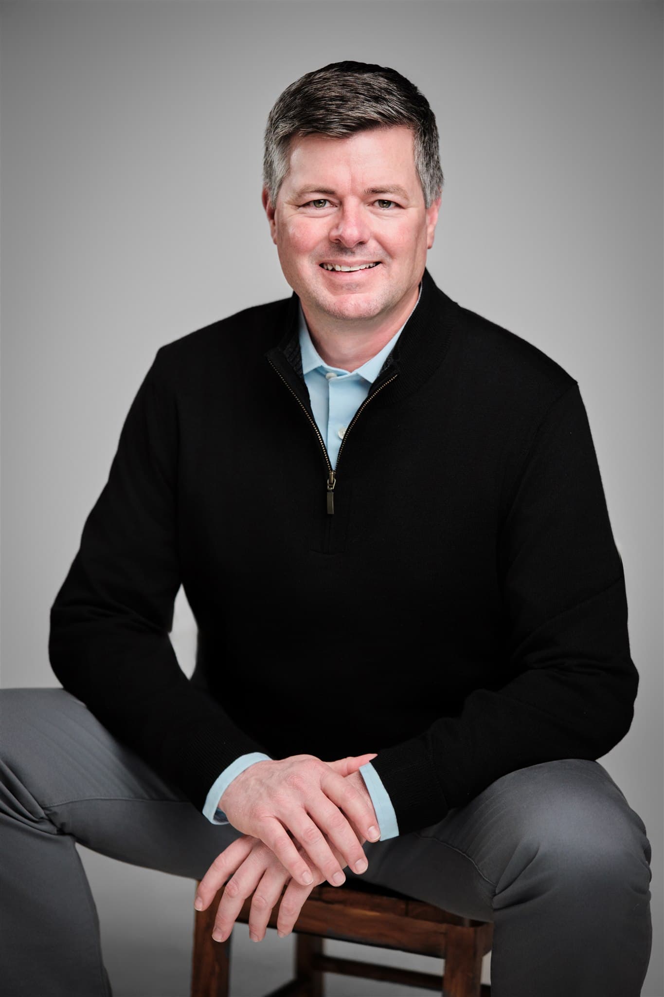
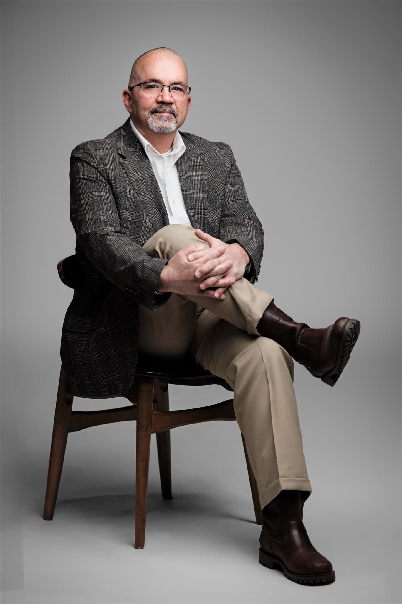
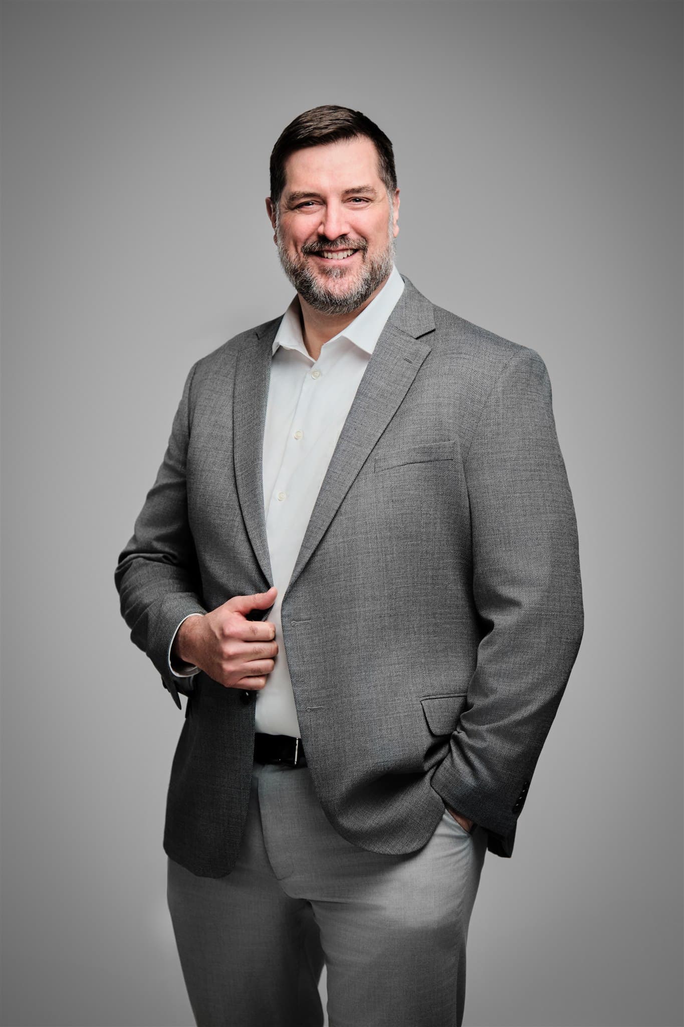
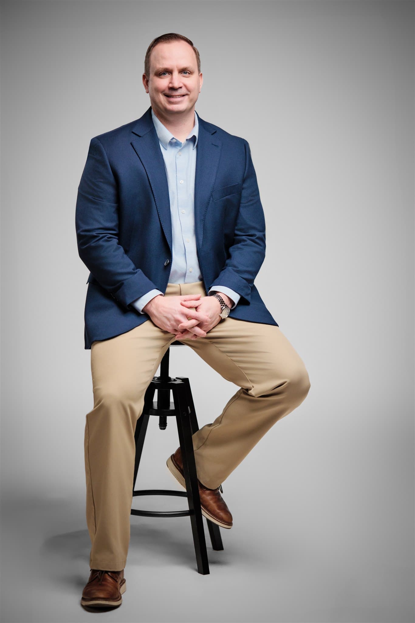
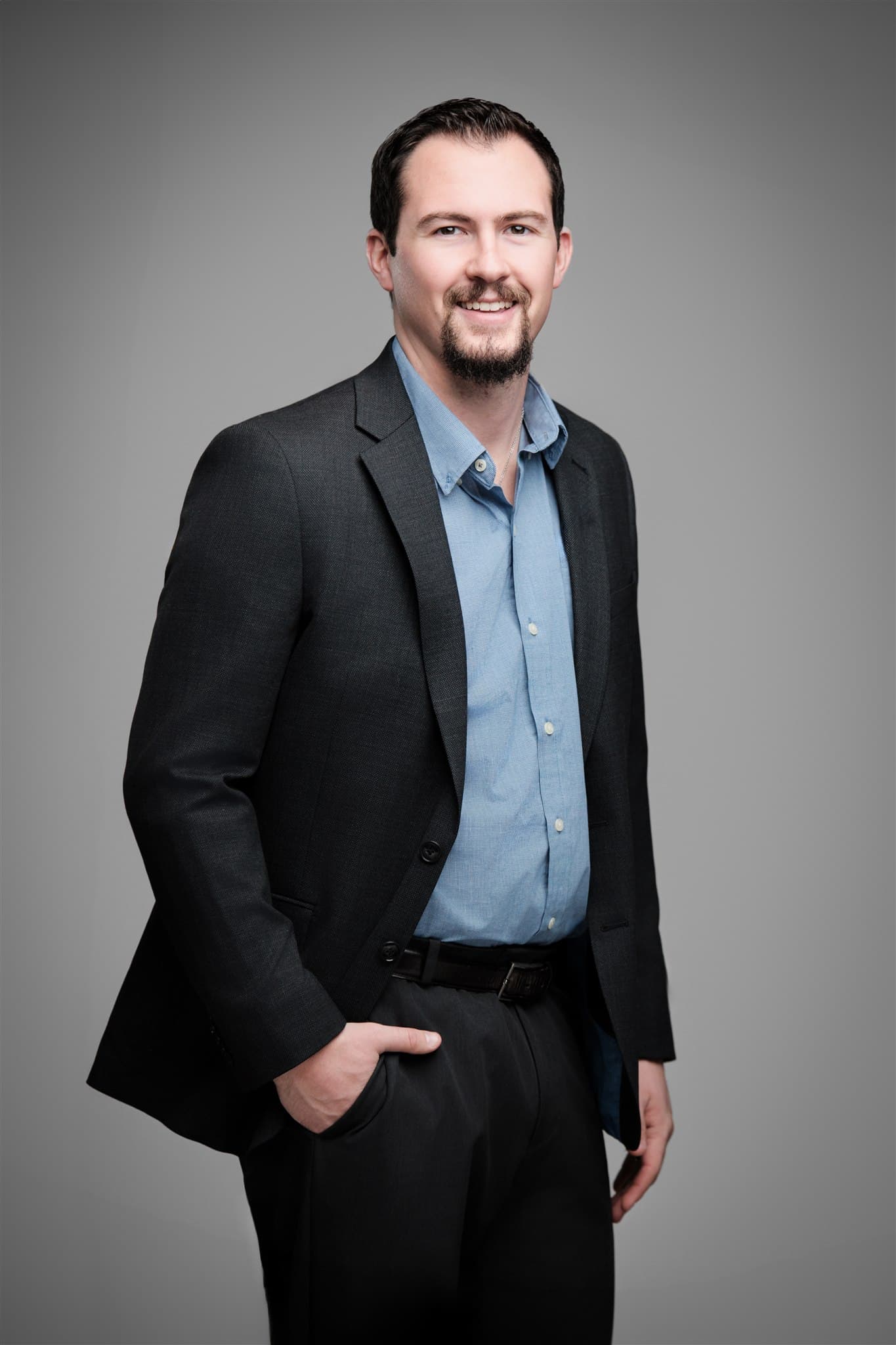
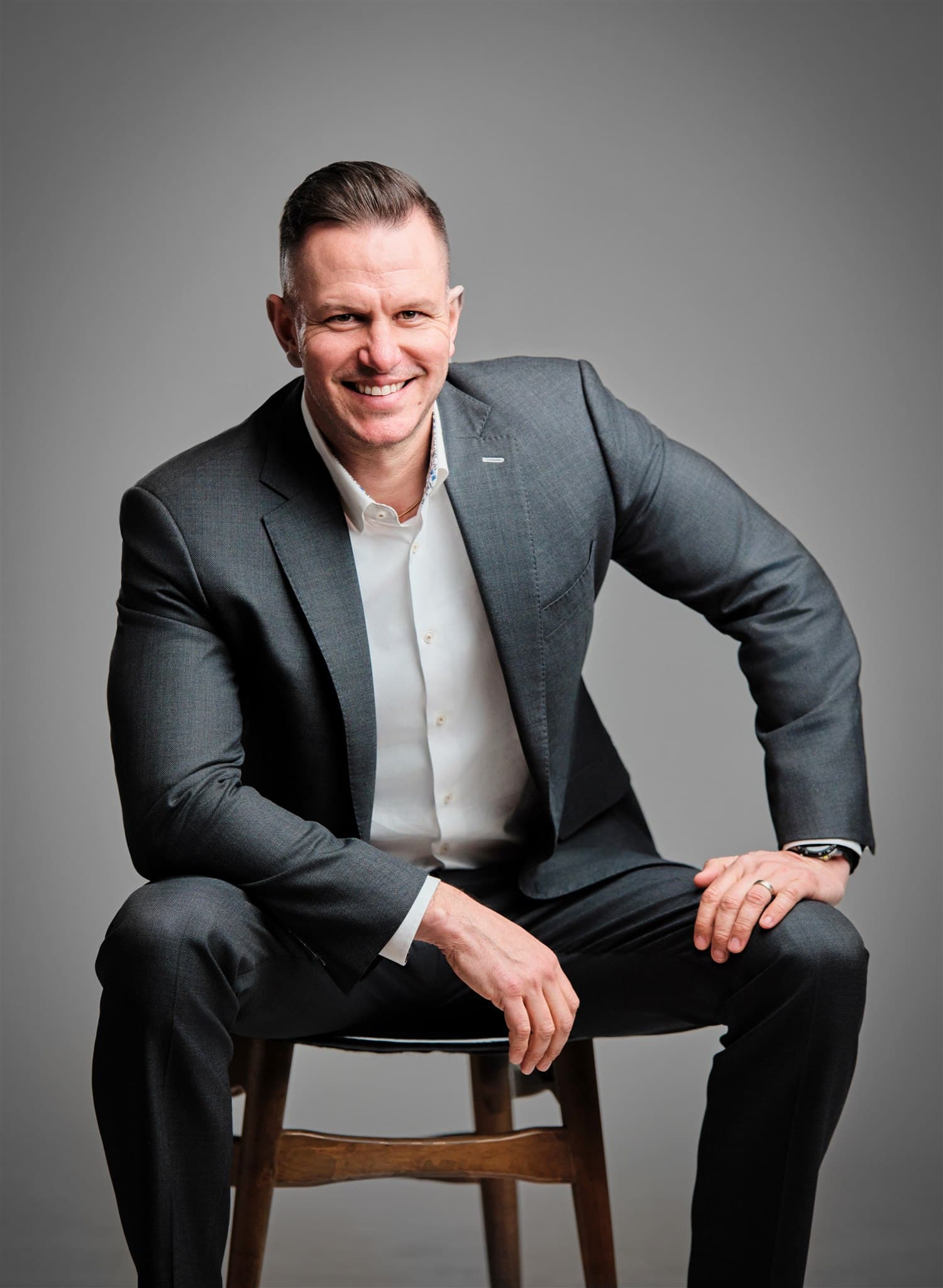
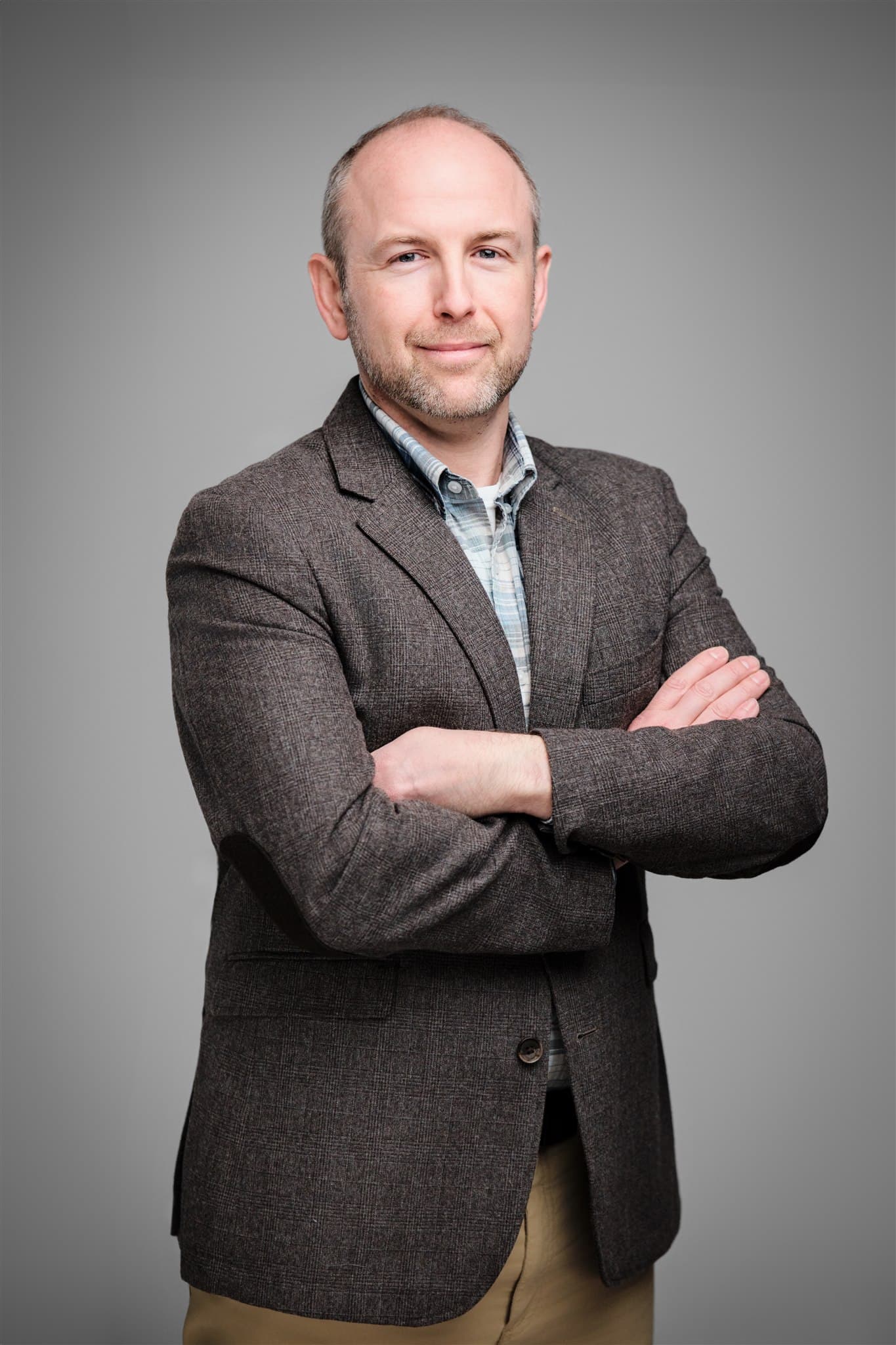
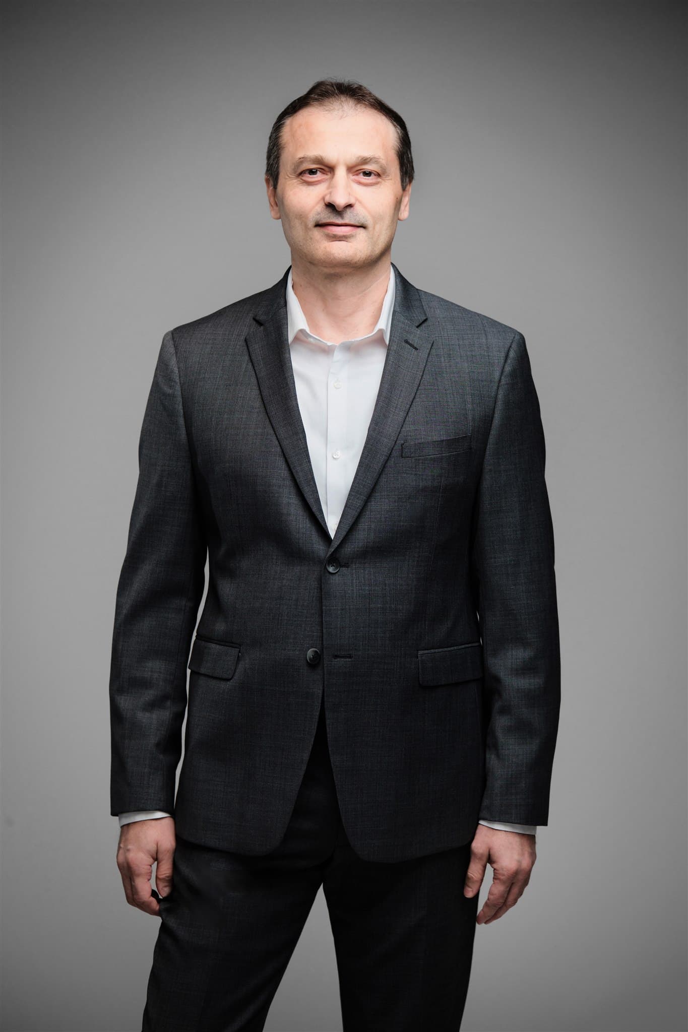
Six IWR North America team members, photographed across multiple offices. White backdrop, editorial styling, lifestyle posing, identical lighting and retouch standard. Not stiff studio headshots. The brand reads as one company on every page it lives on.
Phase 1 · The Diagnosis
IWR North America did not need more headshots. It needed a different kind.
IWR North America had grown across multiple offices, and every office had hired its own local photographer when headshots were needed. Different lighting. Different backgrounds. Different retouching styles. Different decades of camera tech. The patchwork was visible the moment two team members landed next to each other on the company website.
The harder problem was the look itself. The default for industrial and construction industry headshots is stiff, formal, and forgettable. Marketing director Jessie Haupt did not want more of that. She wanted IWR North America to read as editorial: a cleaner studio aesthetic, white backdrop, lifestyle posing, relaxed expressions. The kind of imagery you see in a well-produced magazine profile, not the kind you see on a generic corporate About page.
On individual LinkedIn profiles, the patchwork did not register. On the company website with everyone stacked side by side, the inconsistency read as disorganization. And the patchwork compounded with every new hire. There is no version of “hire local everywhere” that ends in cohesion, and no version of “just take a regular headshot” that ends in the editorial register Jessie was after.
Phase 1 · The Fix
One editorial studio, one photographer, every office.
We built the IWR North America program around a specific aesthetic, not just a consistency rule. Clean white backdrop. Studio lighting tuned for soft falloff that flatters skin without flattening character. Lifestyle posing instead of corporate stiffness: hands in pockets, weight shifted, eyes engaged, expressions that read as the person on a good day rather than the person performing a headshot.
The system itself travels. Same portable studio, same lighting kit, same on-set review, same retouching pipeline, same delivery format. We show every person the position before they try it. They mirror the demo, we capture two or three frames, they walk over to the monitor and pick their favorite on the spot. Nobody leaves wondering, and nobody is surprised when the proofs land.
Because the system is built once and reused, every new hire in every new market gets the same treatment from day one. The IWR North America visual identity does not need policing. It just stays in shape, and it stays in the specific editorial register Jessie defined at the start.
The Modern Approach
No More Stiff Headshots
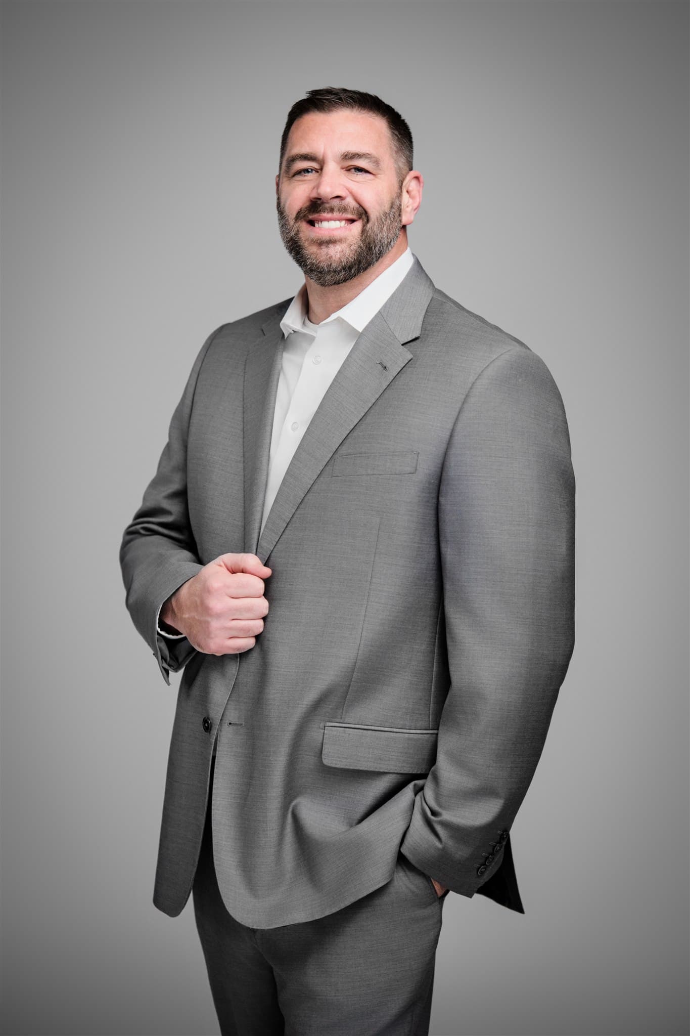
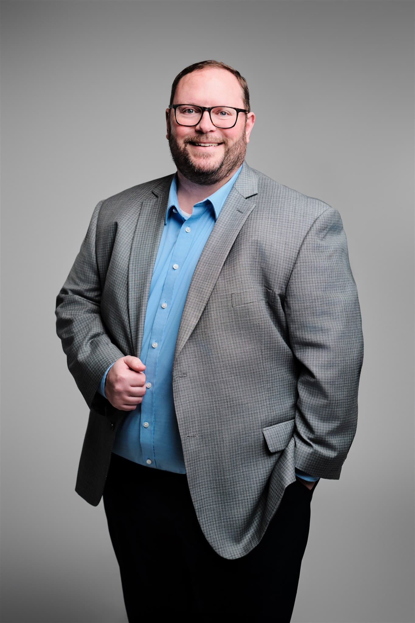
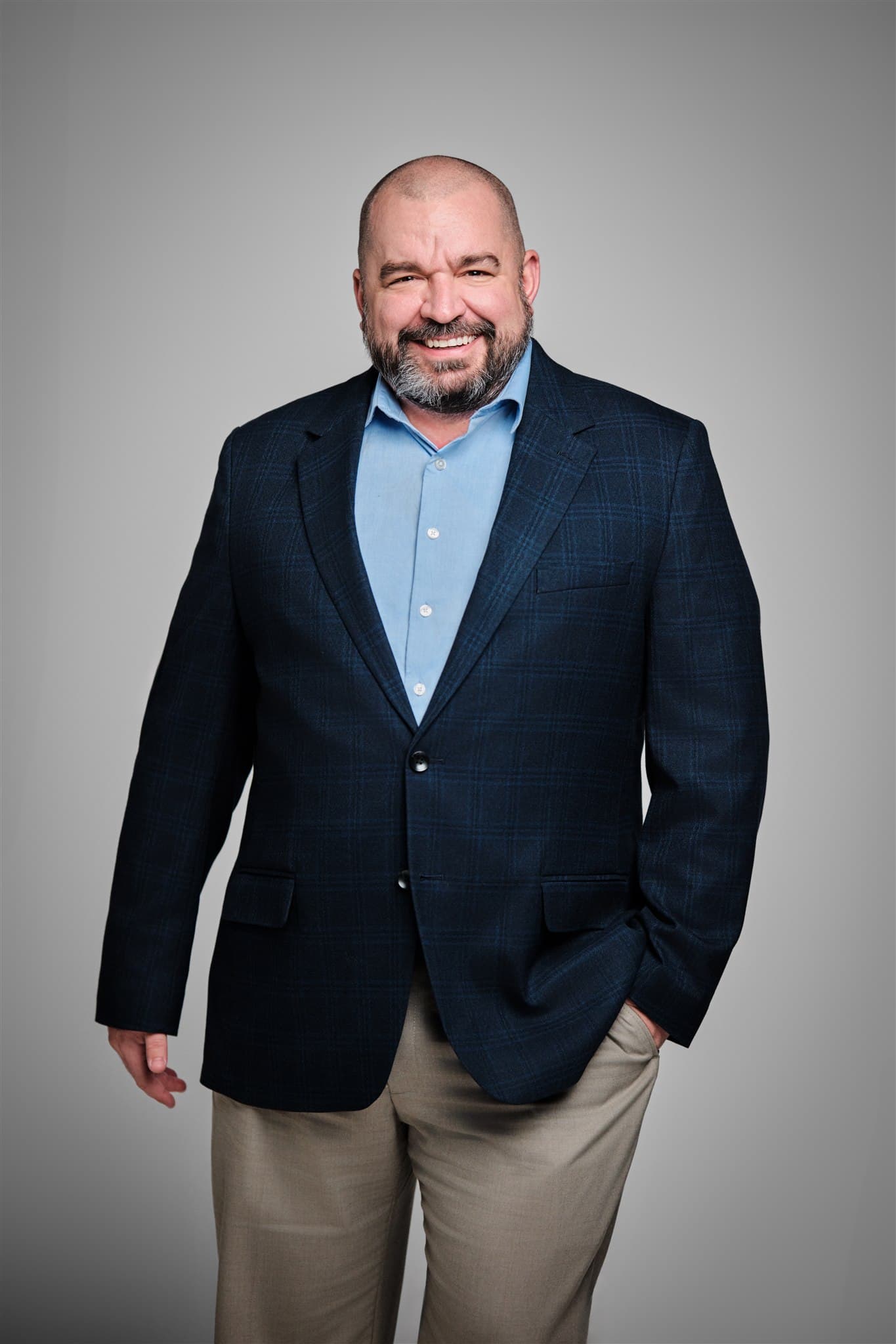
When MHS needed headshots across multiple offices nationwide, they wanted something fresh and approachable. Natural poses that let each person’s personality come through, so clients get to know your brand before they ever shake a hand.
Phase 2 · MHS Legacy · Spring 2026
Same family of companies. Deliberately different visual identity.
The IWR North America editorial program above does its job for the operating company: clean, modern, magazine-grade imagery for a business that builds in the field. MHS Legacy is the parent. A holding company with a different audience, a different cadence, and ahead of a 2026 company-name change.
When Jessie came back to us, the question on the table was a strategic one, not a logistical one. She had seen what the IWR aesthetic produced and explicitly said she was not opposed to keeping MHS in the same register. But she also asked, on purpose, whether there was a stronger argument for differentiation. There was. The parent should not look like the operating subsidiary. The parent should look like the parent.
The vision board she sent for MHS Legacy was deliberately the opposite of the IWR studio set: quiet luxury, heritage, timeless. No backdrop, no corporate signaling, no editorial polish. Environmental portraits in natural light that read as established, restrained, and built to last. The deliberate distance from the IWR look was the point, not a side effect.
We pitched Washington University's Danforth Campus, specifically the Brookings Hall arcade and gardens, as the strongest architectural match for that brief. Limestone, repeating columns, mature plantings, and reliable open shade year-round. We waited for an afternoon with the right cloud cover and brought the team out for a single coordinated shoot.
Brookings Hall · Spring 2026
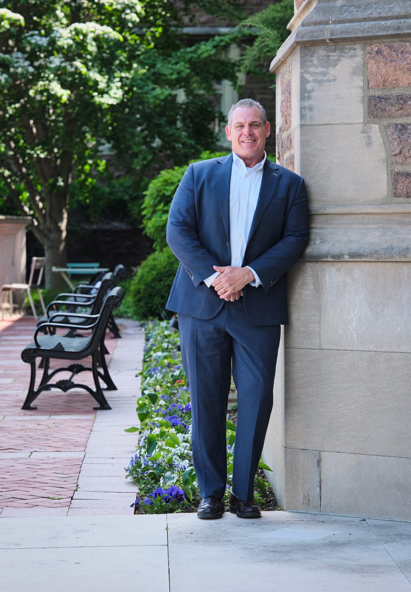
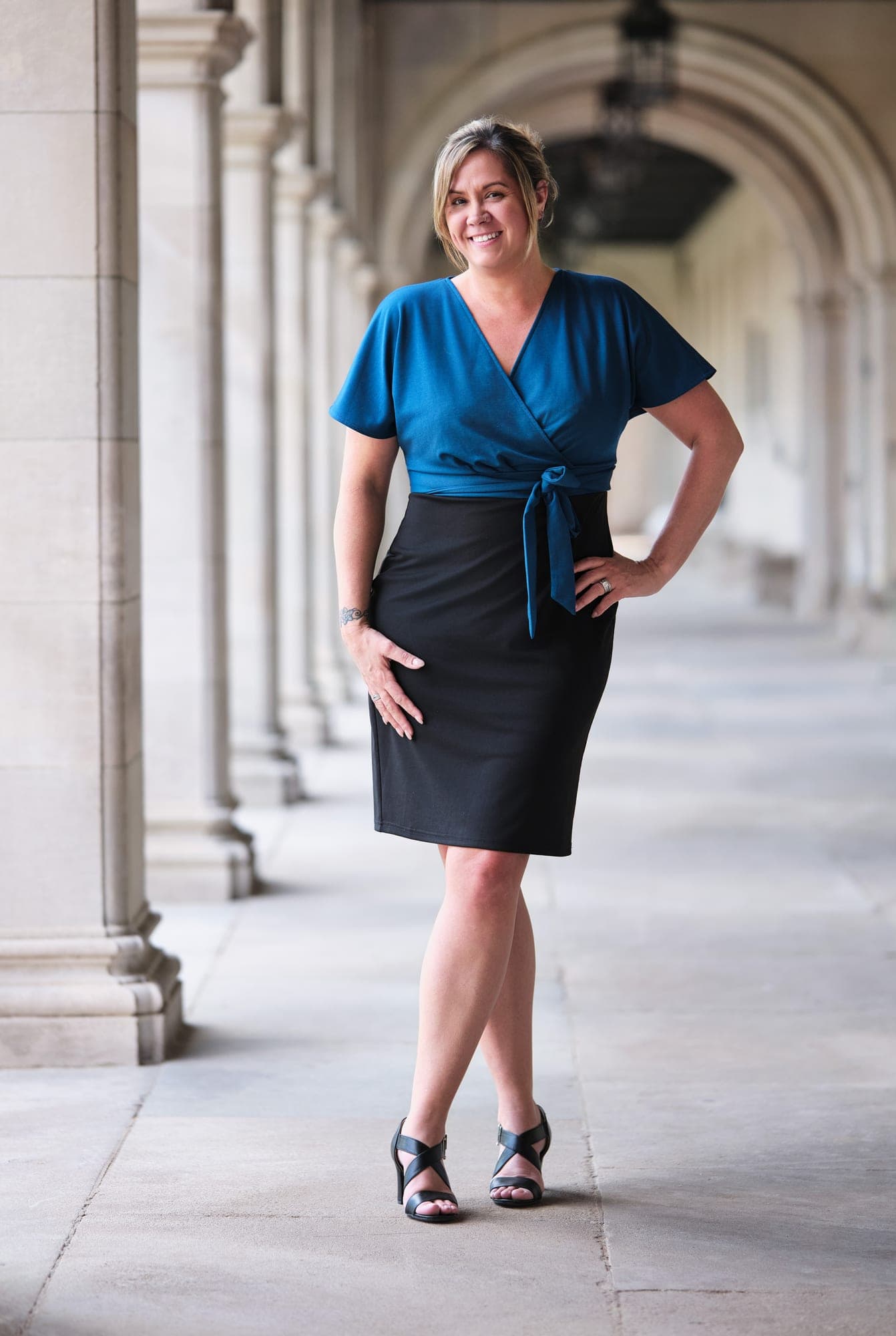
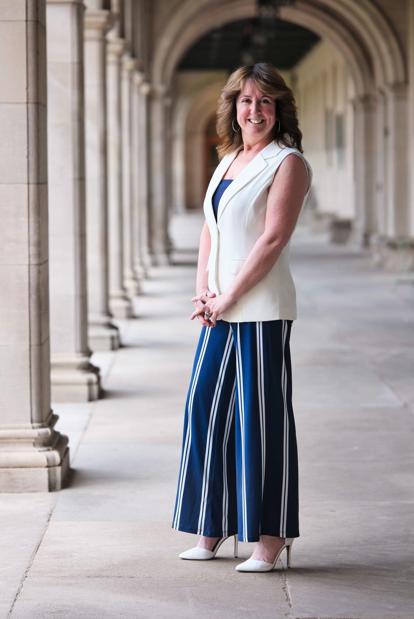
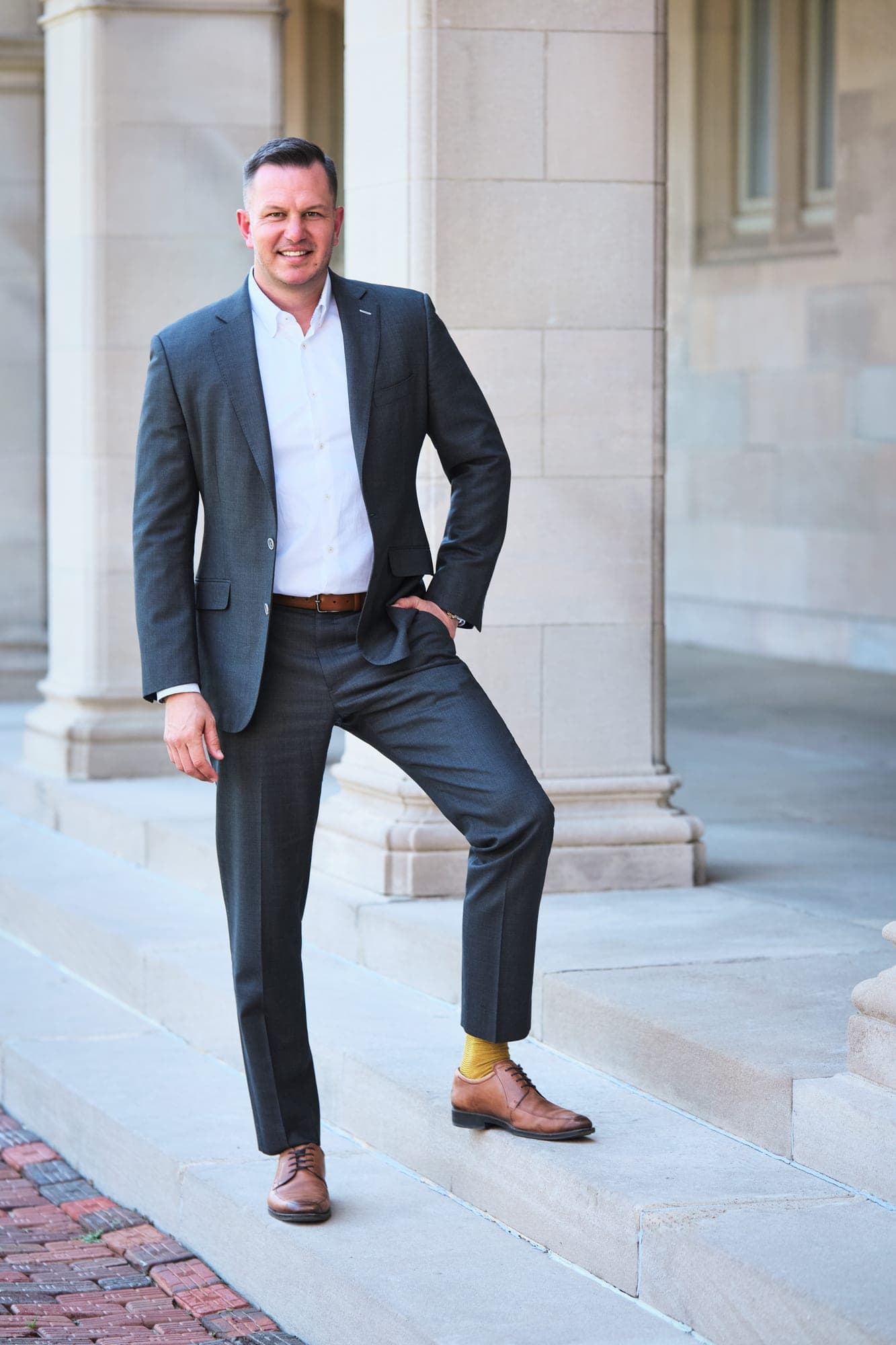
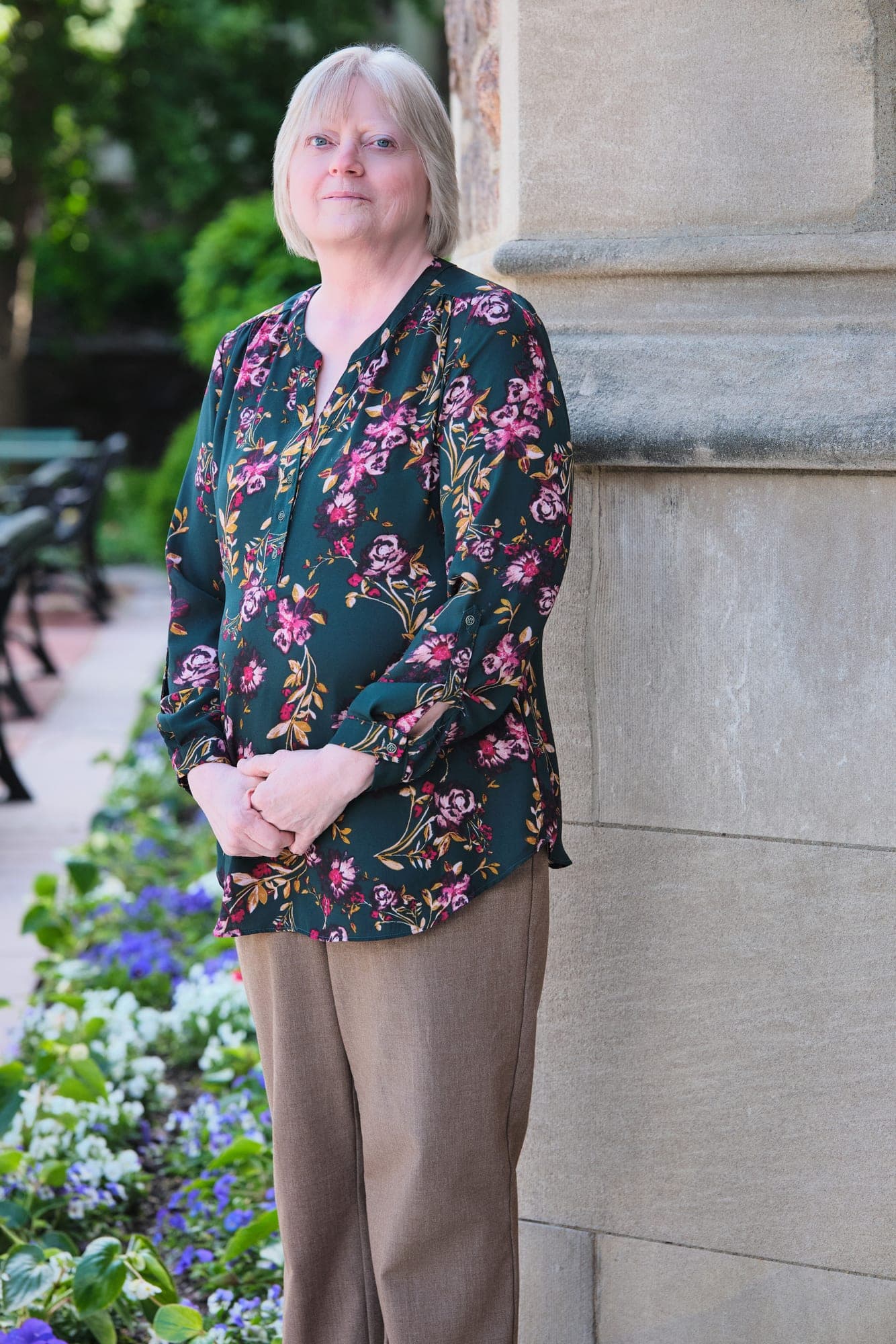
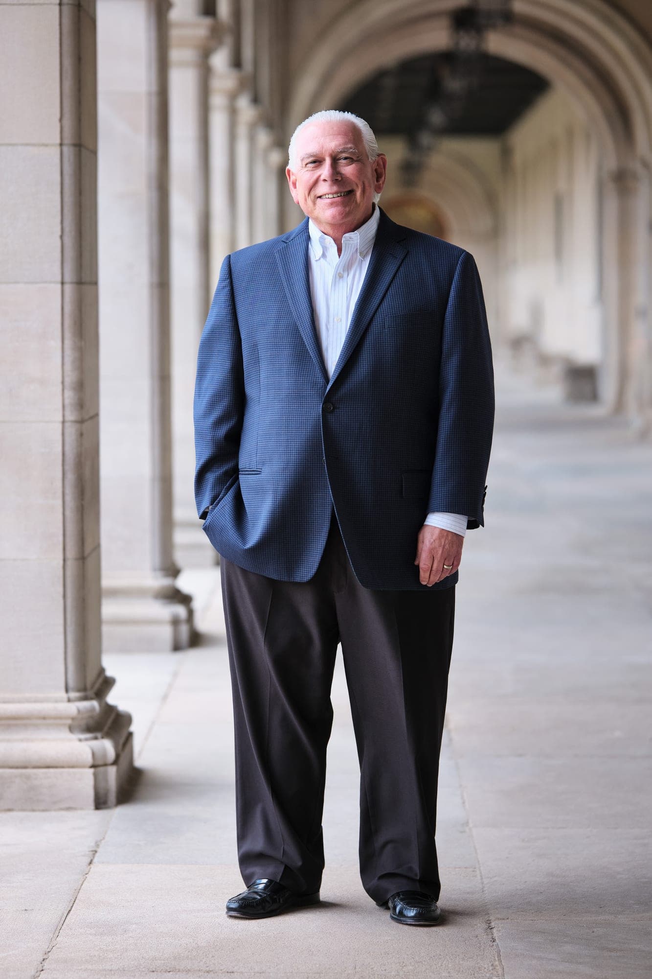
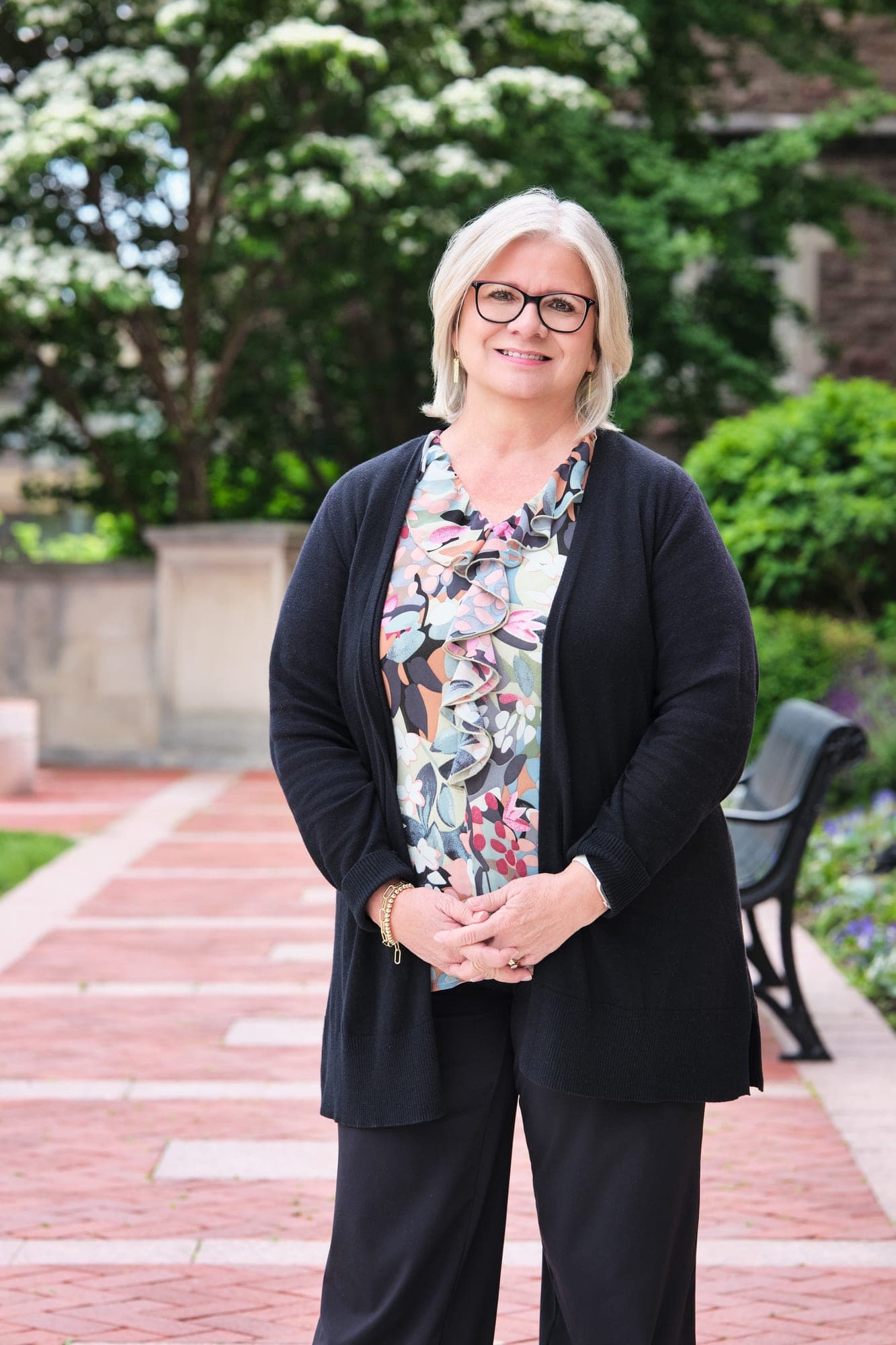
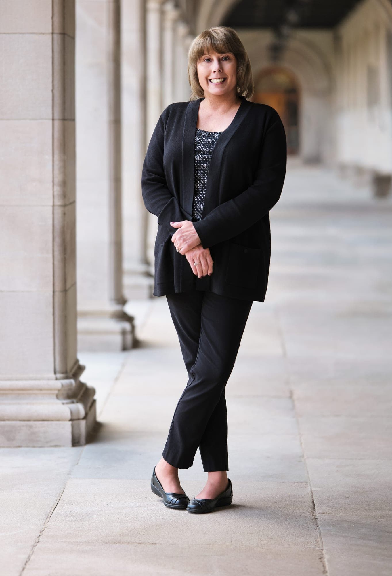
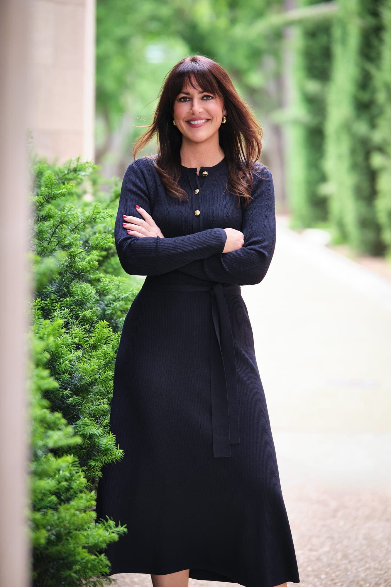
Same shoot, same photographer, same direction. Natural light, open shade, single afternoon at Washington University's Danforth Campus. Each subject coached one at a time on site, with selection from the proofing gallery afterward.
Translating the brief
A vision board is a feeling. A shoot plan is a series of decisions.
“Quiet luxury” is a description of restraint, not a list of props. The work was deciding what to take out so MHS Legacy would not feel like a louder version of IWR North America: no white studio backdrop, no harsh directional sun, no logoed wardrobe, no aggressive retouching. Then deciding what to leave in: limestone architecture, formalwear, hands-clasped or hands-in-pocket posture, expressions that read as relaxed instead of posed.
The forecast called for cloud cover the day of the shoot. We confirmed it was the right call. Overcast on open-shade limestone gives you flatter, more flattering light than direct sun, and it keeps every portrait in the set color-matched to the others. One reference image with strong rim light was the one we deliberately did not chase. Set coherence over a single dramatic frame.
On site, every person was coached one at a time and posed against the same architectural element family. Selection happened afterward in the proofing gallery, where each subject picked their favorite frame. Same retouch standard, same color grade, same crop logic across all nine portraits, so the set reads as one coherent body of work for MHS Legacy specifically. Distinct from the IWR North America library, but not at war with it.
Outcome
Two coexisting brands, two coherent libraries, one strategist.
IWR North America has a visual identity that reads as editorial, modern, and approachable across every office, every new hire, every LinkedIn profile. MHS Legacy has a visual identity that reads as established, restrained, and built to last across the surfaces that matter to a parent company. Neither one borrows from the other. Neither one accidentally looks like the other.
That distinction did not happen because the photographer worked harder. It happened because Jessie Haupt made a deliberate strategic decision about what each brand should signal, then briefed the production work accordingly. The two libraries coexist because the strategy behind them treats them as two coexisting brands, not one brand with two looks.
For an organization with related entities, this is the whole game. Not better headshots, not louder headshots, but a deliberate visual system where every related brand has its own identity and they stand together without melting into each other.
“You nailed it once again! Thank you for your incredible professionalism and outstanding experience for everyone. You continue to deliver the most amazing photos for us!”
Jessie Haupt, MBA
Director of Marketing, MHS Legacy Group
One brand or a family of them.
Whether you need one consistent visual standard across multiple offices or distinct identities across related companies, we plan and execute both as one engagement.
Related work and services
Two related companies given deliberately different visual identities, photographed across multiple locations.