The brief landed in my inbox in late April. Jessie Haupt, the marketing director at MHS Legacy in St. Louis, was preparing for a 2026 company-name change for the parent business. The existing visual library at the operating subsidiary, IWR North America, was already in place: a clean editorial studio program with white backdrops and lifestyle posing that we built together to replace the patchwork of stiff local-photographer headshots IWR had inherited. That library does its job for the operating company. The question on Jessie's plate now was different: should the parent company, MHS Legacy, look like the operating subsidiary, or should it look like itself. She had attached a vision board of natural-light, heritage-leaning reference images and asked the question directly. The answer, and how it became a single afternoon of executive portraits in the Brookings Hall arcade at Washington University, is what this post is about.
The strategic question that came before the shoot
Most photography briefs start with a logistics question: how many people, what dates, where. Jessie's started with a strategic one. She wrote, almost verbatim, that she was not opposed to keeping the MHS Legacy headshots in the same editorial register as the IWR North America library. She wanted my read on whether that was the right call.
That invitation to argue with the brief is the most useful thing a marketing leader can offer a photographer. It changed the conversation from "execute this" to "help me decide what this should be." The right answer for MHS Legacy was not the IWR aesthetic at slightly higher production value. The right answer was a deliberately different aesthetic that would let the parent and the operating subsidiary coexist as distinct brands rather than read as variations of one brand.
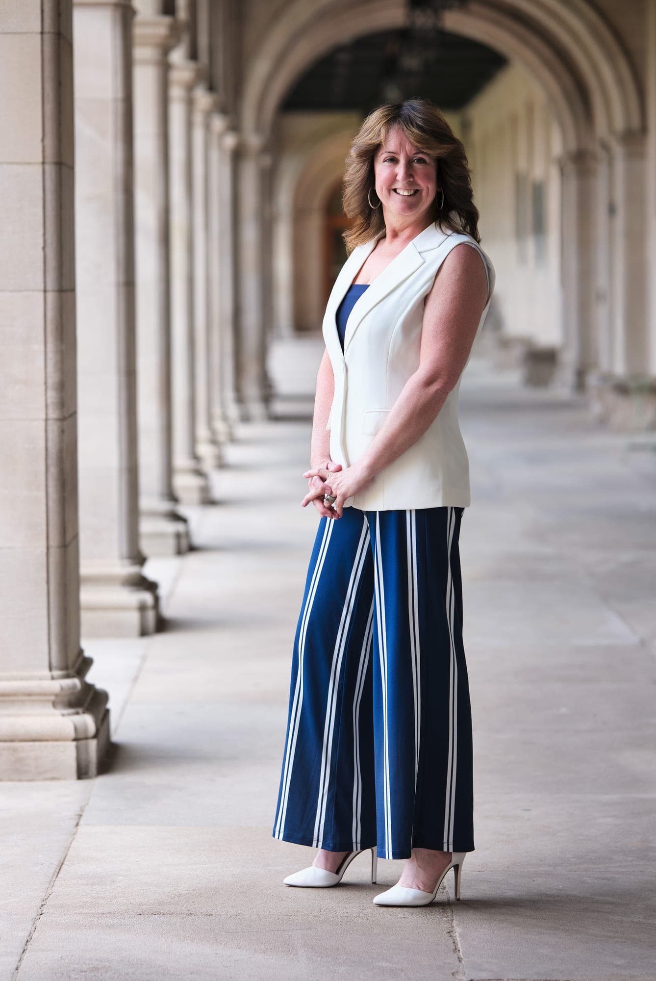
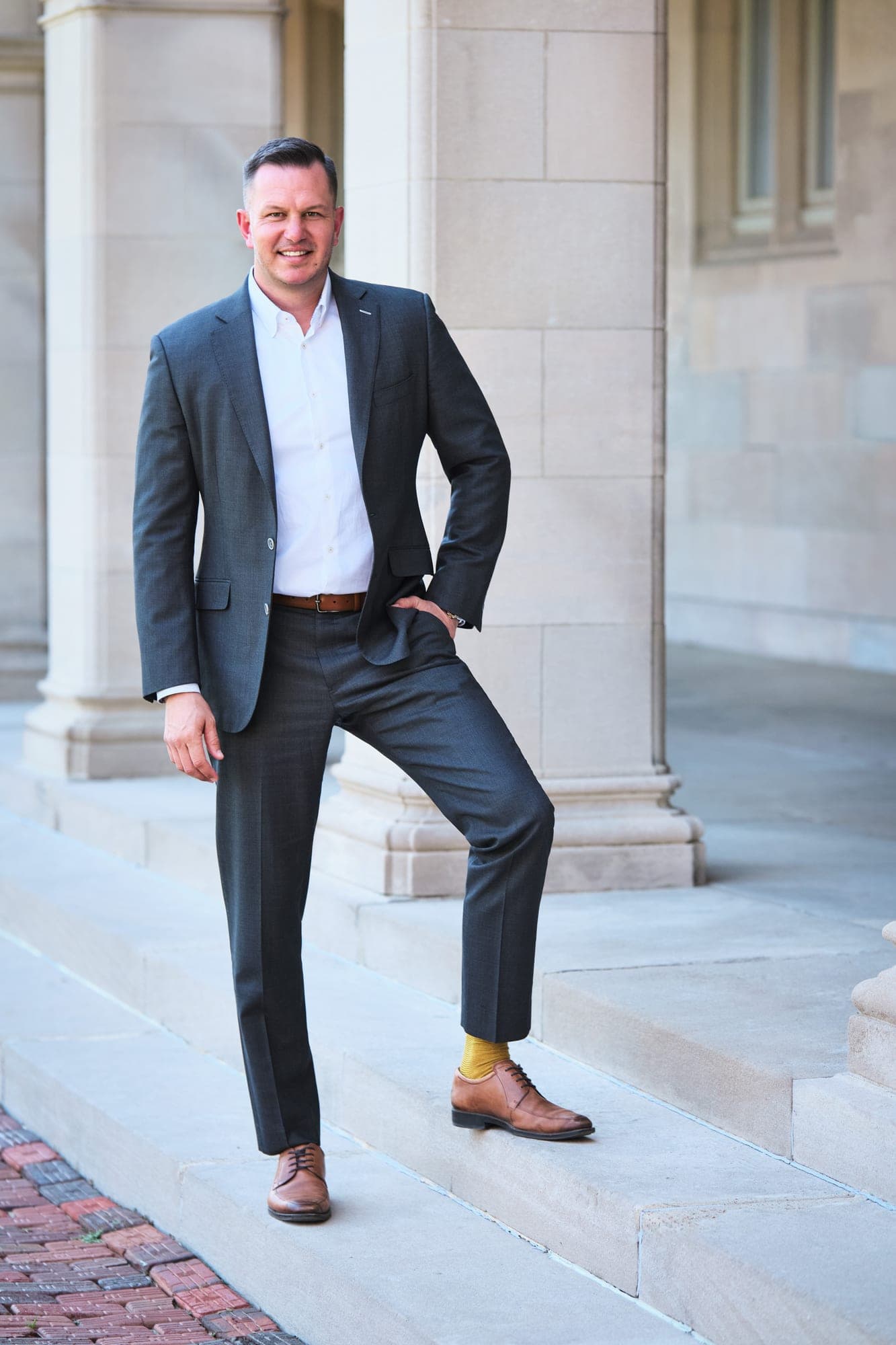
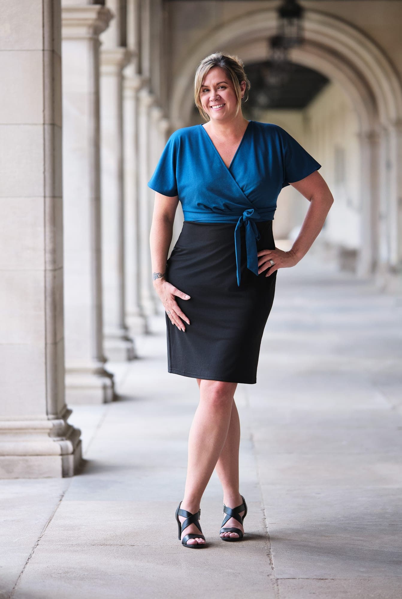
The vision board she sent reinforced the differentiation. Formalwear photographed against limestone, repeating architectural elements, soft natural light, subjects with relaxed posture against permanent backdrops. The phrases that came with it were quiet luxury, heritage, timeless. Read together, those reference images and three words name a specific aesthetic with a long lineage: editorial portraiture inspired by old-world institutions, where the camera confers gravitas instead of the wardrobe or the retouching doing the work.
What I look for in a vision board is the negative space. No studio backdrop in any reference. No fashion-forward poses. No high-contrast color. No tight beauty crop. The references told me what to avoid as clearly as what to chase. Quiet luxury is fundamentally a description of restraint, and once you accept that, the production decisions follow.
Why Brookings Hall on Washington University's Danforth Campus
For a heritage-leaning brief in St. Louis, the question is not where to shoot, it is which heritage location matches the specific feeling. Forest Park, the Old Post Office downtown, the Saint Louis Art Museum exterior, Union Station, and the WashU Danforth Campus all qualify as architecturally serious. Each of them produces a different register.
Brookings Hall on the Danforth Campus was the strongest match for three reasons. First, the limestone arcade gives you repeating columns and arches that frame portraits naturally and make every subject look composed even before they pose. Second, the garden courtyard adjacent to the arcade gives you a soft horticultural backdrop in spring and summer, which adds variation without breaking the visual coherence of the set. Third, the entire location is reliably open shade for most of the day, which removes the lighting variable that breaks most outdoor group shoots.
The alternative locations would have produced strong individual portraits but a less coherent set. Forest Park puts you on grass with no architecture. The Art Museum exterior is too aggressively modern in places and too statuary-heavy in others. Brookings Hall lets you place ten people in slightly different positions across one location and have every frame read as part of the same body of work.
Reading the weather and choosing open shade over rim light
One of the reference images in the original vision board had strong rim light from a low directional sun behind the subject. The forecast for our shoot day showed cloud cover. We had a decision to make: try to chase that one image at a different time of day, or commit to open shade and accept the tradeoff.
We committed to open shade for one reason. A dozen team members shot across an afternoon need to color-match each other on the website. Direct sun produces dramatic individual frames and inconsistent group sets. The temperature of the light shifts as clouds move. Subjects who land in shadow look completely different from subjects who land in direct sun. On a team page or a leadership page, that inconsistency reads as bad photography even when the individual frames are technically good.
Overcast on open-shade limestone is the opposite. Soft, even, flattering light that does not change as you move from one column to the next. Everyone's skin tone reads consistent. The set holds together. The reference image with the rim light was beautiful as a one-off and would have been a bad model for ten coordinated portraits. We named the tradeoff out loud before the shoot and made the call together.

On-site direction for environmental portraits
Studio headshots and environmental portraits require different coaching. In the studio, the subject is the only thing in frame. You direct expression and posture, and the lighting is identical for every shot. Outside, against architecture, the subject has to be placed in conversation with the location. Where they stand against a column. Whether they lean or stand straight. What they do with their hands. Where they look in relation to the camera and the architectural lines.
My default for environmental portraits is hands-clasped front and center, weight on the back leg, eyes to camera or just past it for the relaxed look, and a slight body angle so the architecture frames the subject instead of competing with them. I demonstrate every position myself before the subject tries it. People mirror what they see better than they follow verbal direction, and a relaxed expression is far easier to capture when the subject is not also trying to translate "shift your weight to your back foot" into actual motion.
We shot tethered to a 32-inch monitor placed beside the camera. After two or three frames in any setup, the subject walked over and reviewed. They picked their favorite expression, we adjusted any wardrobe details, and we moved on. Nobody left the shoot wondering what they got. The selection happened in real time at the location instead of two weeks later in a proofing gallery.
Managing visual identity across related brands?
Send over your reference decks and which entities the work is for. I'll come back with a strategy read and a quote within one business day.
Start the conversationThe retouching standard for a coherent set
The retouch on environmental portraits has to be invisible. Studio retouching can hide more, because the lighting is doing more, but outdoor work in soft natural light is unforgiving on heavy-handed skin work. Subjects look plastic the moment you push frequency separation past where it belongs.
The standard I run on a set like this: clean up genuine distractions (a leaf out of place, a passerby in the deep background, an errant strand of hair across the eye), maintain skin texture as it actually is, color-match every portrait to the same neutral baseline so the set reads as one body of work, and crop every frame to the same logic so the proportion of subject to architecture stays consistent. No skin smoothing past what a moisturizer would do the night before. No teeth whitening past their natural color. No eye sharpening. No background swaps.
The goal is a set that looks like the team genuinely walked out to the campus on a quiet spring afternoon and stood in the arcade for a few minutes. Not a campaign. Not a magazine spread. A real moment, photographed well. That restraint is what carries the quiet luxury aesthetic from the vision board into the deliverable.

Two coexisting brands, not one brand with two looks
The deeper question for marketing leaders managing a family of related companies is whether each entity should have a distinct visual identity or share one. There is no universally right answer, but the wrong answer is to default into shared imagery without making the call deliberately.
MHS Legacy and IWR North America illustrate the deliberate version. IWR North America's library is editorial, modern, white backdrop, lifestyle posing. The right look for an operating company that needs to read as approachable and contemporary across every office and every new hire. MHS Legacy's library is natural light, heritage architecture, environmental, restrained. The right look for a parent company that needs to read as established and built to last. The two libraries do not compete because they are not trying to do the same job. They serve different surfaces for different audiences.
The nine MHS Legacy portraits will not replace the IWR North America program for new-hire onboarding at the operating subsidiary. They will sit on the parent company's website, leadership page, press kit, and investor deck. The IWR program will continue to live where it always has. The team and external audiences read each set in the context of the entity it represents, and neither set has to apologize for the other. That is what "two coexisting brands" actually means in practice.
The other thing to know is that the coherence within each set matters more than the volume. Nine portraits photographed by one person on one afternoon at one location will hold up as a parent-brand statement better than fifty portraits photographed across multiple sessions and styles. The visual coherence is the brand signal.
What to do if you are briefing a multi-brand visual system
Three practical moves before you contact a photographer.
First, decide explicitly whether each related entity should share visual identity or have a distinct one. Write down the answer with reasoning. "They share because they sell to the same customer" is a real answer. "They differentiate because the parent company audience is different from the operating company audience" is also a real answer. The wrong move is to default into either decision without thinking about it.
Second, build a separate reference deck for each brand. Ten to twelve real images for each entity, not Pinterest abstractions. Look for what they have in common within each deck and how the two decks differ from each other. Those internal commonalities are your brief for each brand. The differences between the decks are the contrast you are deliberately preserving.
Third, give the photographer enough room to push back on the brief. The MHS Legacy shoot started with Jessie explicitly asking whether differentiation from the IWR North America library was the right call. That conversation happened before we put a date on the calendar, and it was the difference between two coexisting brand libraries and one slightly varied set. The right photographer is the one who reads your brief carefully enough to know what to argue with, and the right marketing leader is the one who invites that argument.
If you are managing a family of related brands and want a second pair of eyes on the visual strategy, send over your reference decks and which entities the work is for. I'll come back within one business day with a recommendation on whether to share or differentiate, location ideas for each, and a quote.